

I began by painting out the shark on a piece of large black fabric, using undiluted acrylic and a huge brush. I tried to paint as quickly as possible to avoid over-blending and caking too much paint on, keeping in mind how effective Ed Hall's paint work had looked when it wasn't done 'perfectly'.
Once the shark was finished I cut it out and positioned it over the red fabric I had chosen to use for the background (the bright red to represent the blood and death). The size of this banner has admittedly pushed me out of my comfort zone, which is usually working at a small, intimate scale where I can use a lot of detail. Because of this, I found it harder to really consider the composition, and as I positioned the shark on the red fabric I forced myself to add the text in a way that would fit around the image.
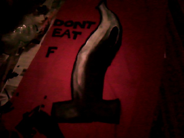
At first I really struggled with what the slogan could be. I came up with lots of ideas, but none of them were punchy enough. In the end I decided to use a slogan suggested by my friend, Amber.
"Don't eat fin fo yo din. Have a heart, leave the shark."
The slang/casual lingo gives it a bit of humour and makes the message more accessible.


Hand-sewing on the letters has proven extremely time consuming, so I haven't quite finished as yet. But on Tuesday our class presented our work to each other and were assigned a 'lucky dip' person whose work we had to do a mini-crit on. Jadine pointed out the following about my banner:
GOOD QUALITIES
like the caption/slogan
text is clear and easy to read
black on red is good 'warning' colour scheme
AREAS FOR IMPROVEMENT
perhaps more work on the composition and where the text may be placed
colours?-maybe another that is more vibrant/contrasting
I definitely agree with the criticism of the composition, but I'm not sure it is something I will realistically be able to alter before the module deadline. After seeing the banner on the wall it was easier for me to examine how effective the composition was (unfortunately I have a very cramped room with not much space to look at it properly from a distance) and it occurred to me that it might have been a bit more interesting to change the scale of the image- perhaps to have big text in the middle and surround it with multiple smaller images of sharks.
No comments:
Post a Comment