FINALLY getting round to doing this post, now that I have a working laptop again!
The end of my final year came to a close and all of mine and my classmates' energies that were left over went into creating firstly the college degree show, and secondly the travelling show, which we created in
Madlab.
The name of our show was Ripe, and
here is the lovely website the branding team created to advertise us.
College
The college show was a wonderful confidence boost. Nervousness took over as we were on our way to the opening night, not helped by the usual debate of what to wear and how formal we were supposed to be. But on entering the building, I was surprised (in a good way) to find it absolutely packed with people. The hot weather and the crowd turned the floor of our exhibition into a virtual sauna, which is a shame because I'd been hoping to get some decent pictures of myself with my exhibition. Dad even went to the effort of bringing his fancy camera. I think he took a few snaps but I was too scared to see how they looked; I felt like I was melting.
[Ta-dah!]
[My tutor Gary and I with my work]
I think I was unnecessarily worried about how my show would turn out. Although it wasn't exactly as I'd hoped, I was proud of it. I received lots of compliments that evening, which I probably received very awkwardly (I hope not). Seeing as this was a project based on a childrens' fairytale, it was nice to hear that some of the children looking round appreciated it- a friend informed me that she heard a child say "Woaaaaw..." as they walked past. I couldn't get a better compliment than that. Over the week that passed my little pocket of business cards disappeared too. It's flattering to think that people have a little piece of me either in their wallets or pinned up somewhere in their home.
As finishing my work took so long (due partly to unhelpful staff) I didn't have the benefit of a carefully discussed pre-planned layout to work with when we were putting up my display. Jo saved me a place with two boards, so I wanted to try and make the most of this. I had the idea that my show should be partly like a memorial to my main character, Mr. Wolf. I hope that people understood this joke....otherwise the flowers in front of the framed picture must have seemed a random addition to the work displayed on the walls. The positioning of the boards meant that my table fitted quite nicely in the middle though, and I made it a little more at home with a rug on the floor too.
Jo helped me decide on the inclusion of the 3D objects on shelves. At first I was planning on not including any of the 3D elements-in my mind I thought it was more important that the 2D pieces spoke for themselves, seeing as the 3D elements had been created with this format in mind. I didn't want it to be a fine art show that ended up being half sculptural- my intention had been to create a book (which I WILL complete soon), and I was proud of the fact that the images had worked well in the form I'd intended, as illustrations that told a story, not just objects. However, in the end I agreed it would be a shame for people to not see the characters that had taken so much of my time to create. Having them placed neatly in line with the 2D pieces was a compromise I was happy with, and they did get a more appreciative reaction than I imagine the 2D work alone would have done.
The decision to mount the work on foam board was another helpful suggestion from Jo. I explained I didn't want each individual piece to be framed. I didn't want each piece to be 'glorified' alone because they were supposed to be together, seen as a whole. The foam board was a simple way to make them slightly more sophisticated than blue-tacking-a-poster-on-the-wall standards, without appearing too formal, and it did look neat once we'd carefully positioned them all up with a mixture of sticky tabs and velcro patches! The printed images on the good quality paper came out very nicely too; slightly glossy like a photo. I'm also glad for the lack of frames as I didn't want viewing them to be spoiled by reflections on the glass-something which always frustrates me at exhibitions.
I remain regretful that I didn't achieve entirely what I'd set out to. The book itself should have been the centre-piece of my exhibit, placed proudly on the table in the middle for people to read. I wouldn't change the pieces of work that are up there, but I feel like they needed the addition of the story words I'd written, a few examples of the vignette ink-drawn images I'd intended to include, and a more carefully planned out layout to really show off my full potential. I'm treating this experience as a valuable lesson rather than a set-back though. Everything I've done on this course that's left me feeling disappointment in myself has only made me more determined to keep improving in the future. And get this book finished! I owe myself that.
[Paul, me and Gleavsie outside the show]
[Got my hands on one of Hannah's t-shirts from the show shop]
Madlab
Bringing down the work at college did not mark the end, it simply set the start date for the work towards the next show. I'm very grateful to the team of graphics students who worked extremely hard to find us a venue, and manage the creation of our show in Manchester. I went with a few other students to help spruce up the paintwork in the building before we were all set to go in on the morning of the exhibition day to re-create our show spaces. Another very important part of the preparation were the invitations to local design agencies. The team came up with the idea that we took little 'ripe' fruit salad trays around to hand out to these people with their invitations. Bryony, Kat, Paul and I spent a day buying and chopping up the fruit for this purpose! I wasn't able to assist on the day when the invitations and fruit trays had to be delivered, but I heard that they got a fantastic reaction, and the agencies were impressed with the thought behind it.
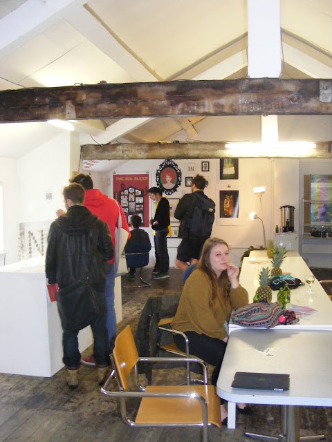


The opening of the show was a little disappointing. It was slow to attract people for a while, but gradually more people came in to have a look. My space didn't seem to attract as much positive attention as at the college show, and very few of my business cards got taken this time. I wasn't too disheartened at the time, but now I worry that it does reflect the unlikelihood of my work's popularity in the illustration industry. People in general seem to be more attracted to illustration work that is drawing based, or graphic looking. In my experience, there is most respect for detailed work, done by hand, but not made and photographed like mine. It's encouraged me to concentrate on building up a better collection of drawing-based work to include in my portfolio and on my website, to hopefully make me appeal to a wider audience (or an audience at all!). I would love to be able to create unique work and for that to be in high demand, but I feel like I'm making life too hard for myself. My tutors encouraged me to stay individual in my approach and try and carve my own niche way into the industry. Although I would love to be able to achieve this, I don't want to attempt what feels impossible right now, especially when I do miss the drawing.
The last night of the travelling show was a sad occasion- it was the last time Bryony and I might be seeing some of our classmates as we were set to move home the next morning! Because of this, the free drinks were flowing, and the atmosphere was bittersweet. I looked around at all our year together and there was this warm feeling, like we were a team and we were really proud of each other, but it was all ending!
Packing up and going home...


