Monday 26 September 2011

Alex Simpson


Alex Simpson graduated in 2010 from, she works in many different ways, painting, sculpture, printmaking and animation. Her work is personal and features strange creatures as described on her profile, are about 'exploring relationships with loss, fear and the unknown'.

What is interesting for you perhaps is the flip between different mediums and how something made, informs her drawings / printmaking - I wonder which comes first. Does the drawing inspire the making or the other way round - whatever the order she seems to be absorbed in her world.

Thursday 22 September 2011

Asami Kiyokawa

I stumbled across Kiyokawa's textile illustration work recently. I was fascinated by how colourful, rich and detailed this work was. She combines literal imagery with pattern, separately and layered up, making it look dreamy and atmospheric.
It really makes me wish I had a sewing machine!


Tuesday 20 September 2011

Last week’s critical studies meeting

We were asked to read an article in preparation for discussion with our critical studies group.
Here is an attempt at a summary of the article I wrote in the session:

This is an essay based on an interview of James Victore by Steven Heller. It discusses his significant pieces of polemical poster works which respond to contemporary moral issues that he feels strongly about; it examines their successfulness and Victore’s progression to create his most effective possible way of impacting, as a graphic designer, on what he perceives as society’s evils.

His work made comment on the following issues:

  • Columbus day celebrations ignoring the inadvertent genocide of the Native Americans.
  • The 1993 race riots in Brooklyn between Hasidic Jews and their African-American neighbours.
  • The right-wing U.S Senator Jesse Helm's campaign for a return to 'family values' (antihomosexual and antiabortion rights).
  • The casual instillation of prejudice and hatred to impressionable young children.
  • The racism inherent in the death penalty.
The text was engaging, and conveys admiration; the writer is clearly very passionate about Victore's work.
He's a very passionate designer; the article suggests he is extremely determined and driven. The following video interview with him supported this.


Sunday 18 September 2011

a new year begins....

Project 1a- Inventive Characters
Our first brief has been very similar to exercises we did in the first year, which were intended to loosen up our drawing styles and get us to approach it more freely. Ironically the restrictions sometimes did force me to draw in a more free and creative way sometimes.

The brief reads: "The figure is the most recurrent element you are likely to represent as an illustrator. Moreover the language for the figure is often the thing that distinguishes the 'individual handwriting' of the illustrator. It is important to remember that this process whilst rooted in academia, it can also be the catalyst for inventive and spontaneous drawing."

We were given a framework of characters and adjectives to pair together to create 6 different characters.
We had to base the drawing method on a set of rules:
  • Draw characters using only straight/ruled lines.
  • Draw characters using only circles/curves.
  • Draw characters using only torn/cut paper.
  • Draw characters using no outline.
  • Draw characters using only printed marks.

Here are some examples of the work I produced:

Some sketches based on the 3D stoat I made, using ink pen, coloured pencil and watercolour (no outline); and the 3d stoat itself!
A stoat i drew within the rough outline from the reverse side of a sewn piece, using only little straight line marks.
An angry fire eater drawn with scribbly pencil (no outline).
A proud king, collaged shapes of patterned paper.
A friendly spider, made with pieces of wool and fabric sewn to paper.
Friendly spiders, dangling from web strings, pencil and collaged paper.

Getting back into working in the studio has been a bit challenging. I am determined to get back into working more naturally in 2d, and regain my confidence with ink and watercolour in particular. I've become so involved with a hands-on, 3d approach that it seems to be my default way of working. I still enjoy drawing, but i am able to create 3d characters with the least thought or effort. I am worried that creating characters with craft based methods in some ways dilutes my own personal 'visual language', in that it is much easier for somebody else to replicate to look of my 3d work, rather than the style of my drawing, which is based much more on gesture rather than practical methods. Drawing is more spontaneous and fragile, less reliable in a way, which makes a successful drawing far more rewarding. (Although i do like my little creations).

Thursday 8 September 2011

Summer brief progression

This is a piece Hannah did, and is the first piece of work I took inspiration from in our swaps. Her use of  varying thicknesses of black line on the white background is striking and effective as an illustration depicting the scene in Waterhouse's painting. I could imagine this appearing on a poster or flyer about the nymphs.


Here is my response from Hannah's piece. I kept the black and white theme initially, using ink pen on white paper, before I added coloured pencil to a copy. Like Hannah's use of minimal features, I left the nymphs faceless, focusing instead on their hair and figures. The hair was initially intended to appear like the waves of the water, but in the finished piece they appear to be floating in air rather than water; ghost like rather than sirens? The lack of facial features makes the nymphs more menacing, and more like objects; as Hylas views them as objects of desire.


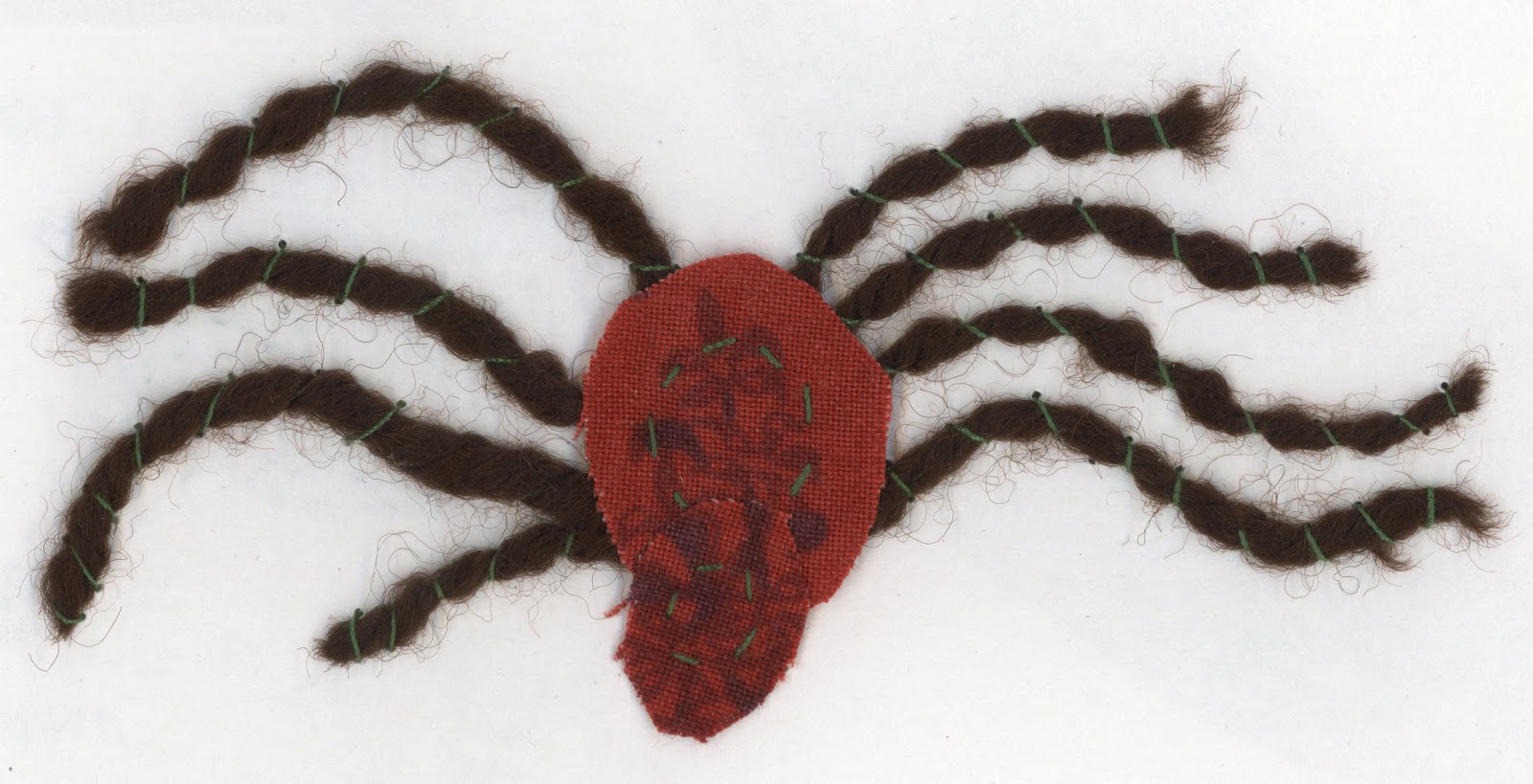
Above are two examples of Bryony's responses. We all naturally seemed to become fond of the use of lines in the hair. It creates a sense of the hair flowing, and links to the idea of water. Visually, it is overwhelming, linking to how Hylas and the nymphs' other victims relate to with the sensation of drowning in the water. 


I wanted to focus more on the faces of the nymphs. Instead of looking at the faces in the painting, I based this face on Marion Cotillard. This is because I was struggling to capture the features of Waterhouse's nymphs and studying their features became counterproductive. Also, when I imagine a nymph (i.e. enchanting faces) she is one of the first people who came to mind looks-wise. I used 2b pencil and ink pen, then photocopied the original and added watercolour. 


After studying the nymphs I decided to focus more on their environment and how I could explore that visually. The nymphs are 'children of nature' and in the painting are surrounded by lily pads, trees and flowers. My studies of these flowers evolved from a sketch I did of some flowers in a park. In the first example I created a 'flower bed', which Bryony elaborated on in her own piece:


Although the difference in our drawing styles is evident, i think the simple addition of Bryony's nymphs gives the odd bundle of flowers a place, giving the nymphs a platform for the iconic figures they are.


Hannah's translucent use of watercolour in this piece is dreamlike and adds to the tranquil atmosphere of the image. My first thoughts when looking at it was that it would make a brilliant design for a stained glass window.


In turn, I added to this piece with watercolour. It is not meant to be a literal background; more like a suggestion of their environment. I think the watercolour became too overwhelming. I needed to use more of a light suggestion of colour rather than drowning the image with it. I think the line drawing Bryony created is far more effective and is more appealing as a simple piece, like a small book illustration.