Tuesday 26 November 2013

Some thoughts on post-uni life.

It's a Tuesday night and I'm sitting for what feels like the first time in ages, at an almost clear desk in my room, with fairy lights on and incense burning, listening to Bon Iver...it feels wonderful.
On an average day at the moment I will be about to climb into a taxi home from a bus journey from work. My current job is a care worker at a home for individuals with learning disabilities, personality disorders, autism and various other mental illnesses. I fell into this job unexpectedly quickly. After the summer break I began to feel that spending so much time at home made me lose my motivation. My enthusiasm for my art was waning; partly due to lack of appreciation, recognition and demand from others, but also due to a negative attitude I was finding it incredibly difficult to break out of. I also needed money badly.
So, I took the job. The shock of full-time, 12 hour shifts has been easier to cope with than I anticipated. Admittedly, it can get mentally and physically tiring...but I have this new sense of well-being that drives me on. I've surprised myself in being able to cope, and I've proved to myself that I'm a stronger person than I've felt over the past few months post-uni. The work is a mixture of stress, adrenaline, careful communication, empathy and determination. My colleagues are amazing people, incredibly capable and tough in the face of a career that is extremely demanding, yet poorly paid when the nature of the work is taken into consideration...and although my shy nature is in contrast to most of their personalities, I feel well supported and (after a couple of months) confident in their company. There are wonderful moments to be experienced with the residents too; I find I've always got sweet little anecdotes to tell. There are times when it's incredibly difficult, but those times don't overshadow the whole experience (as yet!)
I am now all the more appreciative of my days off; the little things like being able to sit alone and think; enjoy a film without the guilt of knowing I need sleep for another early start the next day; spend some time with my family; and of course, put my energy into being creative!

Making art is something I crave now. It doesn't ever feel like a chore because I so rarely get the time to do it. Beside me on my desk I've written a list reminding myself of all the little things that popped into mind that I must do tomorrow. I want to draw, and paint watercolours, SO BADLY. Tonight, I'm going to read. It's been far too long since I've felt awake enough to do that.

It's hard to imagine what the future's going to bring at the moment. Taking it all one day at a time seems to be the best way at the moment. Feeling good.

Wednesday 6 November 2013

Illuminating York

At the weekend mum, Anna and I went for a wander around the sites of Illuminating York; an annual festival of light shows celebrating the city's unique heritage. Limited time meant we didn't get to explore all of the artworks, but the main two we did visit (Clifford's Tower and The Museum Gardens) were captivating projections, bringing to life the familiar buildings. It reminded me not to take for granted the beauty of the architecture we can easily take for granted amongst the bustle of town's shoppers.

Our first stop was at the Clifford's Tower show. This story was of the three Viking Kings of Denmark, who had a strong influence over England, particularly York, at the time. The work was a combination of the efforts of Ross Ashton, an internationally successful projection artist, and Karen Monid, a creative designer of sound art installations. I was very impressed with the way the projections have been created to complement the shape of the tower and its hill. The knowledge of the projections' backdrop added to the atmosphere of the stories- the images present on the tower itself were often suited to the idea of being in a castle interior. I tried to take some pictures and videos, but they don't do the live spectacle justice. However, it's quite impressive to look back on this landmark looking so surreal...
 
After visiting a couple of the smaller, free shows (including one in Coppergate with interpretive dancing!) we finished the evening in the Museum Gardens, where the projected story was a combination of film and animation about the Viking King Eric Bloodaxe. For me, this was the most entertaining part of the night-the humorous narration engaged the audience fully, and persuaded us to stay for the entire show, even though at this point my hands were too cold to operate a camera!

It was a shame our visit had to be so brief, as we missed out on other parts of the festival which I'm sure would have been equally, if not more impressive. The festival brought the cultural side of York alive in a way that appealed to adults and children. It's certainly made me feel as though I ought to take more of an active interest in York's history, and quite proud to be from a place to have such a rich one.

Monday 30 September 2013

Meg the dog

It's been quite some time since I've updated my blog (disgraceful!) as I have been sadly adjusting to life away from Manchester. Oh how I miss it...
However, that doesn't mean to say that I've given up making art work. I've been a busy bee with various little bits and pieces, including this (sort of...cut price) commission for a friend of mine. It's one of my favourite things to do, making a 'mini-me' of a pet. I'm determined to make this one extra special as it's to commemorate his pet dog Meg who passed away recently.
I've approached this one slightly different than I usually do when I make my animals. I've begun by making the head separately first. I decided to do this because I wasn't pleased with the head I made for my last made animal (a fox, which I will do a separate post about) and I wish I'd spent more time getting it right before rushing on to the body to get it complete quickly (the body being relatively easier and less fiddly to make well).
 
When I started bending my wire to make the structure of her face shape, the most important thing seemed to be the muzzle. I used two parallel pieces of wire which form the centre of her face in general, and curve around at the bottom to form the muzzle. Building the rest around that was fairly easy. I quickly got onto the knitted covering and have now got a great idea of how her head will look when it's finished (complete with shaggy-haired ears). It didn't look right at all until I added what will be the eyes. The important decision was whether to use pins or make embroidered eyes. My first instinct was to embroider the eyes on and use a dot of white paint for the shine of them catching the light, as I did with Monty (below).

 However, it became obvious after I stuck a couple of pins in that they were the perfect choice in this case. Meg's eyes are very big and shiny and one of the main reasons why she has such an endearing face! I couldn't achieve that using thread and paint. I will soon be taking some better quality photos of my work in progress, but for now here's a quick peek at how she's looking...

...to be continued!

Monday 29 July 2013

T-SHIRT!

In my post-box this morning I was very excited to find a package with my very own printed t-shirt in it! I designed and ordered this on Vistaprint as an initial experiment to see how it would look, and I'm so happy with it. I'm considering getting more with different illustrations from my Little Red Riding Hood set done, it's just a question of whether people would be interested in buying them....

Sunday 21 July 2013

Little White Lies Competition

I was very excited to hear that the magazine Little White Lies (which I have previously done a competition brief for) is running a competition to design a poster for the up-coming film Only God Forgives, directed by Nicolas Winding Refn.

(see the details here)

It's keeping me busy at the moment! I only wish the film was out already. I've been watching the trailers repeatedly for reference:
...and the latest edition of Empire Magazine also has quite a revealing article on it. The brief says 'We're looking for the most interesting and unique designs, something that captures the tone of the film.', so I'm trying to think of unusual ways to get across the feel of it. So far I've decided on one important thing: the main character's hands are very important.
In the Empire article it says:
'The star is a man of few words...in Drive, his soulful stunt-driver spoke with his boot heels and wheels. In Only God Forgives, it's all about his hands.'
I also found a post on Tumblr with a quote from Nicolas Winding Refn (along with these gifs) about the importance of the hands:
'The first image in the movie that I ever came up with for the film was this—I thought well, I want to do a fight movie and I started looking at my hands. And if you look at your hands like a tight fist—it’s obviously like a very sexual aura. It’s like a very sexual image. Like all men’s extension of their sexuality: violence. But if you open your palm, it’s about submission. And I thought: “God, there’s a movie in this movement.” '
 ...so, I know that Ryan Goslings fists, and this gesture that Refn's fascinated by, will be something essential to focus on. Immediately the thought of building wire hands flashed into my mind. Will I use 3D elements here? I'm not sure how I could make it work.

Another important element I'm considering in relation to the design is the setting: Bangkok. The city is reminiscent of The LA location of Drive, but somehow much more surreal. Visually, the film seems unnatural; full of neon lighting contrasting to the dark of rooms or night-time streets. It reflects the trashy side of the city's criminal underworld which Ryan Gosling's character seems to exist in, but it also looks dream-like and hypnotising. Colour will be something else to think carefully about, and not something I can work particularly confidently with. But I like a challenge!

Today I've been working on a drawing of the character to get me started, using painted ink, pencil and pen. Here's a quick look at it in progress. I hope it resembles who it's supposed to...
 
 
 ...and some more progress...
...and the finished drawing. I was thinking it might look good with a simple red, bold font with the film title inbetween his arms over the image. But sadly I don't have photoshop to complete this simple task at the moment. And I was too late to enter the competition also, which is a shame. But I'm happy with the image.
 

Saturday 20 July 2013

The Shows- RIPE!

 
FINALLY getting round to doing this post, now that I have a working laptop again!
The end of my final year came to a close and all of mine and my classmates' energies that were left over went into creating firstly the college degree show, and secondly the travelling show, which we created in Madlab.

The name of our show was Ripe, and here is the lovely website the branding team created to advertise us.

College

The college show was a wonderful confidence boost. Nervousness took over as we were on our way to the opening night, not helped by the usual debate of what to wear and how formal we were supposed to be. But on entering the building, I was surprised (in a good way) to find it absolutely packed with people. The hot weather and the crowd turned the floor of our exhibition into a virtual sauna, which is a shame because I'd been hoping to get some decent pictures of myself with my exhibition. Dad even went to the effort of bringing his fancy camera. I think he took a few snaps but I was too scared to see how they looked; I felt like I was melting.
[Ta-dah!]
[My tutor Gary and I with my work]
I think I was unnecessarily worried about how my show would turn out. Although it wasn't exactly as I'd hoped, I was proud of it. I received lots of compliments that evening, which I probably received very awkwardly (I hope not). Seeing as this was a project based on a childrens' fairytale, it was nice to hear that some of the children looking round appreciated it- a friend informed me that she heard a child say "Woaaaaw..." as they walked past. I couldn't get a better compliment than that. Over the week that passed my little pocket of business cards disappeared too. It's flattering to think that people have a little piece of me either in their wallets or pinned up somewhere in their home.
 
As finishing my work took so long (due partly to unhelpful staff) I didn't have the benefit of a carefully discussed pre-planned layout to work with when we were putting up my display. Jo saved me a place with two boards, so I wanted to try and make the most of this. I had the idea that my show should be partly like a memorial to my main character, Mr. Wolf. I hope that people understood this joke....otherwise the flowers in front of the framed picture must have seemed a random addition to the work displayed on the walls. The positioning of the boards meant that my table fitted quite nicely in the middle though, and I made it a little more at home with a rug on the floor too.
 
Jo helped me decide on the inclusion of the 3D objects on shelves. At first I was planning on not including any of the 3D elements-in my mind I thought it was more important that the 2D pieces spoke for themselves, seeing as the 3D elements had been created with this format in mind. I didn't want it to be a fine art show that ended up being half sculptural- my intention had been to create a book (which I WILL complete soon), and I was proud of the fact that the images had worked well in the form I'd intended, as illustrations that told a story, not just objects. However, in the end I agreed it would be a shame for people to not see the characters that had taken so much of my time to create. Having them placed neatly in line with the 2D pieces was a compromise I was happy with, and they did get a more appreciative reaction than I imagine the 2D work alone would have done.
 
The decision to mount the work on foam board was another helpful suggestion from Jo. I explained I didn't want each individual piece to be framed. I didn't want each piece to be 'glorified' alone because they were supposed to be together, seen as a whole. The foam board was a simple way to make them slightly more sophisticated than blue-tacking-a-poster-on-the-wall standards, without appearing too formal, and it did look neat once we'd carefully positioned them all up with a mixture of sticky tabs and velcro patches! The printed images on the good quality paper came out very nicely too; slightly glossy like a photo. I'm also glad for the lack of frames as I didn't want viewing them to be spoiled by reflections on the glass-something which always frustrates me at exhibitions.
 
I remain regretful that I didn't achieve entirely what I'd set out to. The book itself should have been the centre-piece of my exhibit, placed proudly on the table in the middle for people to read. I wouldn't change the pieces of work that are up there, but I feel like they needed the addition of the story words I'd written, a few examples of the vignette ink-drawn images I'd intended to include, and a more carefully planned out layout to really show off my full potential. I'm treating this experience as a valuable lesson rather than a set-back though. Everything I've done on this course that's left me feeling disappointment in myself has only made me more determined to keep improving in the future. And get this book finished! I owe myself that.
[Paul, me and Gleavsie outside the show]
[Got my hands on one of Hannah's t-shirts from the show shop]
Madlab
 
Bringing down the work at college did not mark the end, it simply set the start date for the work towards the next show. I'm very grateful to the team of graphics students who worked extremely hard to find us a venue, and manage the creation of our show in Manchester. I went with a few other students to help spruce up the paintwork in the building before we were all set to go in on the morning of the exhibition day to re-create our show spaces. Another very important part of the preparation were the invitations to local design agencies. The team came up with the idea that we took little 'ripe' fruit salad trays around to hand out to these people with their invitations. Bryony, Kat, Paul and I spent a day buying and chopping up the fruit for this purpose! I wasn't able to assist on the day when the invitations and fruit trays had to be delivered, but I heard that they got a fantastic reaction, and the agencies were impressed with the thought behind it.
 
[Bought myself a Hannah Sumbland t-shirt this time!]
 
 The opening of the show was a little disappointing. It was slow to attract people for a while, but gradually more people came in to have a look. My space didn't seem to attract as much positive attention as at the college show, and very few of my business cards got taken this time. I wasn't too disheartened at the time, but now I worry that it does reflect the unlikelihood of my work's popularity in the illustration industry. People in general seem to be more attracted to illustration work that is drawing based, or graphic looking. In my experience, there is most respect for detailed work, done by hand, but not made and photographed like mine. It's encouraged me to concentrate on building up a better collection of drawing-based work to include in my portfolio and on my website, to hopefully make me appeal to a wider audience (or an audience at all!). I would love to be able to create unique work and for that to be in high demand, but I feel like I'm making life too hard for myself. My tutors encouraged me to stay individual in my approach and try and carve my own niche way into the industry. Although I would love to be able to achieve this, I don't want to attempt what feels impossible right now, especially when I do miss the drawing.
 
The last night of the travelling show was a sad occasion- it was the last time Bryony and I might be seeing some of our classmates as we were set to move home the next morning! Because of this, the free drinks were flowing, and the atmosphere was bittersweet. I looked around at all our year together and there was this warm feeling, like we were a team and we were really proud of each other, but it was all ending!
 
Packing up and going home...


Thursday 20 June 2013

Major Project Evaluation

Looking back on the last several weeks of work, I'm fairly proud with what I've achieved; although when comparing my initial proposal to the actual final outcomes, it is clear to see that my work does have some significant weaknesses.
To begin with, I'm happy with the creative aims of the project. I chose a story that has a personal appeal to me, and that kept me engaged and determined in the work from start to finish. Choosing to create a book was an ambitious goal, considering I have had difficulties in the past with similar work related to narrative illustration. But I think it was important for me to strive to create something that had a purpose beyond superficial aesthetics, since I have always found storytelling appealing, and (trying to say this without sounding obnoxiously pretentious) am interested in making art that has a deeper meaning to it-something to express my beliefs/interests. I feel that my research into the story itself helped a great deal in informing the character of (I felt) the main protagonist, Big Bad Mr. Wolf. His appearance gives him a personality that I don't think is often portrayed in other versions of the tale: he is an endearing, misunderstood character, despite his devious actions against Little Red Riding Hood; in a way, I wanted to get across in my images that he is a product of his loneliness, and the confusion between his animal instincts (to hunt and eat prey) and his desire to dress up like a gentleman and be human.
Since the importance of the story research was particularly in looking at the metaphorical analysis of its message, planning the narrative was otherwise simple, and not a problematic part of the project. I wrote a version of the story myself which deviates very little from other generic versions; hoping that the images themselves would be the more significant factor in making it stand out as something of my own. My visual research was mostly focused on the setting of the forest, which I think made sense as most of the images would use this scenery as a background, and I feel very lucky that I managed to wander round such a beautiful German forest as inspiration, and use the actual tree branches I gathered there as the trees in my woods!
Technically, I'm pleased with the development of my working method. Although the thought of creating a wolf that could be mobile enough for a successful animation was scary at first, I'm happy to say that I pulled it off! My animation demonstrates the movement I wanted to be able to achieve, and I think as a stand-alone object, he is probably the best creature I've made as yet. In fact, it was hard not to get carried away taking a million pictures of him and making images based solely on his character! I think I did a little bit, actually, but it proved to work in my favour as I'm now the proud in-house illustrator of this year's college newsletter!
 Little Red Riding Hood was also a success, and has a surprising amount of movement herself. Sadly, she wasn't ready in time to be involved in the animation side of things, but as I viewed her as a less significant character, this didn't bother me too much. My problem-solving in her production involved risk-taking, using a material I've not had practice with (modelling clay), which probably should have been tackled at an earlier stage to allow for experimentation, but the gamble paid off. Creating the forest also required some quick thinking when I realised the tree branches were too heavy to stand well on their own, but picking the mod roc to stabilise the structure was a wiser decision in this case as I've had plenty of experience using it before (just not for this course!) I think the research is evident in the production of the woods, and the atmosphere of the final images. I'm happy that the illustrations convey the story effectively, with the tone and atmosphere I wanted.
However, despite the fact that my production methods have evolved positively, I am still lacking confidence in the relevant computer software needed to really bring my work together and make it cohesive for its set purpose (in my case, the obvious part that's missing is the arrangement of the pages and the text together, ready to be printed as a book). I'm also disappointed that I didn't complete the drawings I had planned to place in between the full illustrations. The drawing side of the work became forgotten about, when originally I wanted to integrate them effectively with the photographs. I still aim to complete this eventually, and although it's sad that I don't have the final product ready to be marked as part of my degree, I'm happy to now spend a little bit more time perfecting everything before I will send it to be bound professionally. (The pressure is on because I know certain family members have been requesting copies!)
Professionally, I think I have obvious strengths and weaknesses. My organisation skills still need a boost. I feel that if the work had accelerated quicker in the initial few weeks I would have found the production towards the end much less stressful. But personal circumstances also intervened and had a terrible effect on my motivation. Although I've had an extension, I still feel the negative impact of this is evident in the standard of my work. I was aiming high, but I've accepted I couldn't quite get there; at least I tried my best. I would just love to know what my best could have been! (Life, eh). Aside from the work itself, I've still been keeping my blog updated regularly with critical posts about myself and also looking at contacting the industry and learning more and more about influences and inspiration. I have identified artists who are achieving success in the kinds of 'niches' I'd love to get into (who unfortunately haven't responded to my attempts at contacting them), but attending the craft convention earlier this term opened my eyes to the fact that there are helpful people out there who will show interest in my work. I just need to maintain my enthusiasm for what I do, keep making, keep getting myself out there and ultimately not give up on what I'm passionate about.
In conclusion, the end of this project has been a bittersweet victory for me. I'm relieved that it's over, and positive about the future, just frustrated at my short-comings this time round. It still feels like a valuable learning experience. Although I think I've developed a strong 'illustrative voice' which feels like me, I am still refining and improving myself, which will probably be an ongoing process for some time to come. This isn't necessarily a negative thing, just something that will require perseverance and a strong belief in myself. As long as I can get that confidence back, I think I will be ok...

Thursday 13 June 2013

New Business Cards!

I ordered some new business cards in time to put on display at our show. I got a mixture of Leon the Lion designs and ones of Mr.Wolf, and I'm really happy with how they all look! The information on the back is up-to-date with my professional email (emily@emilydenison.co.uk) and new website address (emilydenison.co.uk). I had no idea how many I'd need to order, but they've been disappearing fast this week, which has been a confidence boost! More will be needed for our travelling show...

Friday 31 May 2013

Putting the characters together

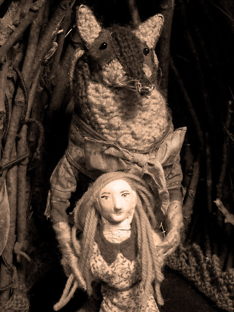
Here are some test photos I took of Little Red Riding Hood and Mr. Wolf together so far, using his alcove as a back-drop. I'm pleased to say I think they work quite well together!

And I tried them with a sepia effect...like an old fashioned family photo, which I'm also happy with...

Thursday 30 May 2013

Making Little Red Riding Hood

I finally got round to the big task of creating my human character, Miss Hood!
I put this off for a long time as it's something I've been terrified of doing, and the process has involved a lot of risks, with little time to experiment and improve. As it stands, she is almost finished. Once I have her looking in a state I'm happy with I will take a few practice photos alongside my wolf, and the scenery, to see if anything needs changing to make her look better in context.
So, I began by creating the basic shape for her body. Instead of using wire alone, like the 'skeleton' of my wolf, I used part of an egg box to speed up the process, and avoid how fiddly using wire at such a tiny scale would be.
The focus at this point was mostly on the strength of the legs, and the shape and support of the feet so that the figure can stand easily...
Then I started making her clothes, and made sure her size was appropriate next to the wolf. I'm happy that she looks tiny and vulnerable next to him.
Next it was time to strengthen the body...
I made the decision to use mod roc because I wanted to add weight to the figure, and I also knew it would be possible to improve the shape quite easily with this material (i.e. building up curves slightly on the bottom and chest, and pulling in the waist while the egg box cardboard was dampened). I avoided placing mod roc over areas I want to be mobile, so the legs are still able to bend at the knee, and the arms will be constructed with a more flexible covering over the wire.
I was still very worried about how I was going to do the face! At such a small scale, it would be a challenge no matter what method I used. I considered building up the basic shape of the nose and cheeks with wire, then working over it in mod roc or paper mache, but it seemed too fiddly and with unpredictable results. It was time to try something new: plasticine! I made a trip to Fred Aldous to browse their selection of modelling clays. There were so many different kinds, I didn't know which one to pick; after a long time I settled on a small pack of skin coloured Staedtler 'Fimo soft' modelling clay.
This was my first time using this material in my illustration work, and I had very little confidence when approaching the face construction. It felt impossible at first; I was just squashing the clay into the hollow gap I'd left and hoping it would somehow shape into an adorable character. I was unsure if I'd be able to achieve a realistic style, or whether I should deliberately simplify her features. I attempted the former with a picture of a girl's profile silhoette as reference.
[Girl's profile silhoette by Darren Whittingham]
This basic picture really helped with shaping. I added clay to the top of the head and managed to mould the nose and chin (quite well for a first try I think!) I tried to do this quickly-I thought if I spent too much time messing around with the face shape I might spoil it and frustrate myself trying to make it perfect.
She was ready for the oven! I baked the figure at roughly 100 degrees c for 30 minutes. It was hard to find information on whether it was safe to bake mod roc, so I kept rushing to the oven nervously to check it hadn't cracked, but thankfully it came out fine! And the plasticine was solid and ready to paint.
The colour of the plasticine seemed a bit too dark for how I wanted the complexion, so I mixed a paler colour from acrylic paint for her head and shoulders.
The hardest part was tentatively painting the features of the face. I kept having to wipe off the paint and going over it again, but I'm pleased with how she looked at the end of the day.
Once she has arms and hands to hold her basket full of grandma goodies, I'll be almost ready!