Wednesday 19 December 2012

Website Research

Next semester, once our dissertations are finished, our critical studies days will be replaced by lessons learning how to build websites and create animations.

I'm very excited to make my own website! If all goes to plan, I will be able to sell my work on it in the future, and I'm hoping it will get me noticed and bring me a lot more opportunities.

As I'm quite ignorant in the ways of technology, at the moment I haven't got any idea what is achievable or not in terms of the layout of my future website. Judging by the best illustrators' websites I have looked it, it is best to keep things simple and accessible. But I also like a little sense of mystery! e.g. I like the sites that start off with a page with nothing but an image/animation that you have to click on to 'enter' the site, like opening the page to a book. A good example of this is Lord Whitney's page:
From the sites I've seen, it is more usual that the site opens onto a page displaying several pieces of work, with links of categories to navigate through it.
Lizzy Stewart's site uses this layout:
As you scroll down the page the images move up and down but the title links on the left remain stationary. The small images of her work are also quite mysterious, and being able to access them very quickly for a better look is convenient for clients that might be in a hurry to get an impression of what the art is like. It seems like this might be the wisest layout for illustrators who are just starting out, so that the work is right there for impatient potential clients.
Andre da Loba also uses a similar layout on his site:
Recently I was introduced to Abigail Brown, who creates 'textile art'. Her site is an interesting mix of the two different layouts I've looked at above. When it opens; the navigation links for the site are at the top of the page but only a simple set of four adjacent photos is shown underneath. To get a better look at the work or find out anything about it, you have to click on the links to find out.
I noticed that Lizzy Stewart's site has been created on the site Cargo, and Lord Whitney also have a site on there. They look very professional and not at all 'templated'. The opening page describes the site:
For the last few years Cargo’s main goal has been to create accessible tools and a networked context to enhance the exposure of talented individuals on the Internet. 

To achieve this, we offer our users free-standing websites; a wide variety of customizable templates; simple but sophisticated tools to control the way their content is displayed, and a unique user interface built entirely around the work shared by our members who are connected through the Cargo network. 

Today, thanks to the consistent quality of the work presented here, we like to think of Cargo as a creative community participating in a constantly evolving visual culture, defined by the exceptional content that finds its way here. 
 
It sounds like a good way to get started! Maybe it's something I will be looking into. 

'What does Illustration mean?'

Over the years of being on this course, the same question has popped up again and again: what even is illustration? It's quite a hard discipline to pin down with a neat definition.

Surprisingly (to me anyway) a lot of people, besides being able to describe it articulately, don't seem to have a clue what it is. I often have to add "it's an art course" when I explain to people what I do. Other people have immediately assumed I'm going to design tattoos...and it seems the most confusing of all when I try to explain that my style of illustration is based around making things that I photograph.

Traditionally, I would have always thought of the drawings or paintings in story books, etchings in old-fashioned newspapers...that sort of thing. Nowadays, the world of illustration has opened up to a variety of different approaches and uses. The boundaries between illustration and craft, illustration and fine art, illustration and graphics, illustration and photography...(etc)...all seem to be blurring. Illustration is no longer confined to drawing, and often good draughtsmanship isn't even necessary; it is the art of creating an image. Modern illustrators are usually expected to be capable with computer programs to process, refine or transfer their work. With the ever increasing pace of technology development, there is pressure to adapt to the newest gadgets with the way we approach our work. However, that is not to say that traditional skills and techniques have gone out of the window. A lot of illustrators create work that can be as simple as pencil drawn scenery. Craft-based art work has become trendy recently too.

A very simplistic way to describe illustration is the enhancement or expansion of a story/idea visually. The illustrator's job is to make something accessible; particularly in the world of editorials where the image can be used to draw a reader in. In children's story books the illustrations are often the most important part; it tells the story visually for children who are still learning to read; (and of course even more so in picture books). More weight is placed in the meaning of the images in this context, as the illustrator's style has a very strong role in defining the tone of the story. In adult books the illustrations are not essential, but serve to enrich the text...and perhaps offer an alternative viewpoint into the story. They can be very subjective depending on the illustrator's style or how abstract they may choose to make an image. They are not mere diagrams of the events being described; they are an offering of the world created by the words. The saying 'a picture is worth a thousand words' is true.

Illustration may not necessarily tell a story either; it can be a purely decorative art form- used for various forms of merchandise and clothing etc...to make something look attractive. Many working illustrators rely on this to sell their work independently; to sell their work online or at craft fairs etc. Try and imagine a world without illustration and I don't think anyone could envision quite how dull it would be.

To conclude, I've had a quick look around to see what other people think.
Wikipedia has quite a concise definition that I like:
An illustration is a depiction that is created to elucidate or dictate sensual information.
Also, David Apatoff, an art blogger, has written an interesting post about the distinction between fine art and illustration here, which offers quite a comprehensive argument on what illustration is.

Tuesday 18 December 2012

'Hopes, Fears and Opportunities'

So far this year I've been trying to approach my work in a similar way to how I became comfortable in the 2nd year. Unfortunately, I've come up against some problems and failures that have knocked my confidence slightly, but I'm hoping to put those mistakes behind me and get back on track to put my skills to their best use for the final major project.

Our first project for the module (following the light hearted one day brief) was the zine project. The aim was to adapt the work we had begun over the summer from our personal projects into content for our zines. At first I was very excited by the idea of making my own, and found our visit to the zine library very inspiring; it made me consider how I might like to produce my own after graduation. I think self-publishing is something I would be well suited for. However, I think the main downfall for me during this brief was that my work over the summer had lead sculptural pieces. Adapting this for a zine just didn't seem to work, but I tried my best. Unfortunately I misjudged my time management and spent far too long actually finishing the sculptures (I added two more to make a set) before I could think about translating them into a format suited for the zine. I have spoken previously about some of the downfalls of this work, and ways I had hoped to improve it in this post.
I wish we had known about the zine before we began our personal projects over the summer, then I could have thought about creating work that would have been more appropriate. In retrospect, the idea behind the heart sculptures was too abstract and vague to work well for a zine. A simpler idea I had planned to respond to for my personal project was that dreams of certain sorts related to bodily dysfunctions (e.g. it has been a superstition that dreaming of suffocation indicates a problem with the dreamer's lungs). If I had created a more extensive collection of bodily organs to illustrate this idea, I think they might have looked effective photographed, then compiled in a zine.

For the next project I chose to go with the Folio brief to illustrate Brave New World. The big problem here was that my method was far too time consuming. I became so wrapped up with the idea for one of the illustrations that I didn't consider the others well enough, and the birds that I made as part of the first image took me far too long. I still hope to complete these and enter the competition which closes in January, but using a quicker production method which relies more heavily on my transferred drawings rather than 3d objects. And I think I might try and speed up the process by producing smaller scenes to photograph.

During the second half of this project I also started learning the processes of drypoint and etching. As these are new to me, I do need practice to get the knack of the technique, but I absolutely love it! I definitely hope to include either process in work for my final major project. I would like to experiment cutting them out and using them as elements in scenes/sew them onto 3d objects etc.

Over the past couple of weeks I had started to slip into panic mode when I didn't complete these two projects. I have, however, become very enthused by the current brief, The Fish Tank Project. The very open premise is to respond to a song of your choice in order to create an installation for a design agency. This has allowed me to start creating images based on a film I love which has a very famous soundtrack song. I was very happy with the finished result of the Little White Lies project last year, so the thought of creating something along the same vein for this is spurring me on. In this last week I have chosen to focus on finishing my design for this brief, as it is the one I feel I can create my best work for.

I am still a little unsure about what my proposal for the final major project shall be, but after an informal chat with my tutor I am feeling optimistic about creating a self published book, drawing from all of my skills to make something that is really me. It might not even include text, perhaps just a picture book. I would like to maybe base it on a fairytale or folk tale, something that includes animals and fantastical scenery, something that I can create rich, atmospheric images for. I would also like to take advantage of my hand-made method and explore some animation- most likely stop motion, but I'm also interested to see what our animation classes next year will inspire me to do. The story I would draw inspiration from is going to be very important so that I don't run out of motivation or ideas, so this is something I will have to think carefully about over Christmas.

The Paper Cinema


A couple of weeks ago I went to see a live re-telling of the Odyssey by the Paper Cinema, at the Contact Theatre in Manchester. I tagged along with one of my tutors and a group of first years, but it was so full that I had to squeeze in a seat on my own. However, there wasn't a moment of boredom once the show began. It was stunning!

I wasn't sure what to expect, as I'd never heard about them before or seen any of their work, but I was intrigued by a short video about them, which, teasingly, gave very little away.
“The Paper Cinema is an illustrated song, a shadow, a smoke, a mirror, a puppet show, a cinema show, side show, magic show, a show and tell, a show off. It exists in the meaning of live music and live drawings.
Best to see The Paper Cinema with your own eyes…”
-The Paper Cinema 

Here is a trailer for the show. In my opinion, it doesn't quite do the quality of the live experience justice, but it introduces the viewer to the set-up: there are puppeteers who control the cut-out characters and scenery in front of a camera, which is projected live onto the main screen above the stage, while a team of 3 musicians perform live music and vocals for the soundtrack and sound effects. One of the puppeteers drew characters live during the opening sequence as well.

There wasn't a single part of the performance that didn't seem to require incredible talent to pull it off, especially as the show was so long (their first feature length story) and no visible mistakes were made. The puppeteers, as well as organising the many cut-outs that were used, had to carefully manage the composition of the images in the camera shot (a few times I spotted them looking up at the big screen to check the positioning was ok). They used a variety of maneuvers to make transitions between the different puppets in the shot, e.g. moving cut-outs of houses with windows in them closer to the camera so it zoomed into the window and framed a view of different puppets behind it.

As well as focusing on the puppets from a 2d perspective, there were times when the elements became more 3d, e.g. a man shot an arrow into a target, which was then rotated to show an arrow sticking through the card the target was made from. Although details like that did give the show a little more visual variety, it seemed impractical and unnecessary to include more; the 2d set-up was already impressive enough.

And of course, it wouldn't have worked anywhere near as well without the soundtrack and sound effects. The main musical elements were guitar, keyboard and violin. The violinist was also a vocalist and could play a saw; the keyboardist was the main vocalist and could play the drums: and the guitarist had a variety of pedals to layer music during the more dramatic scenes. I'm sure I've forgotten other bits and pieces. A few times during the show I found myself distracted from the events on screen by the musicians; it was hard to believe just the three of them could create the sounds and music that they did. The main vocalist I found particularly fascinating because of the diverse quality of her voice; how she could provide the eerie, haunting singing of the sirens then change to a deep guttural scream for another scene showing a storm at sea.

When the show ended the applause was very loud and appreciative. A few people even rose from their seats as they clapped. The audience was invited to meet the members of the Paper Cinema team after the show, but unfortunately I had to leave rather quickly (and I think there will have been quite a queue!)

For a better written and more extensive review of the show, I would advise reading this article by Harry Chapman of The Arbuturian.

Monday 17 December 2012

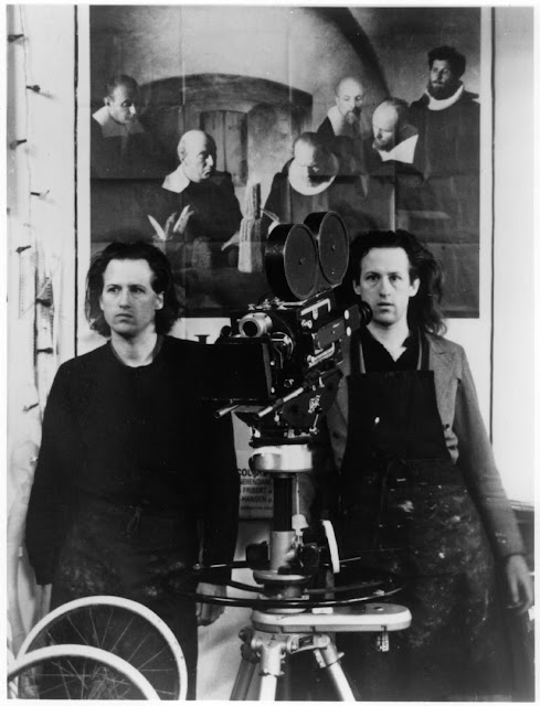
The Quay brothers

Recently I have been introduced to this very interesting pair of artists, the identical twins Stephen and Timothy. They are most famous for their stop motion animated films, a medium they progressed into after many years as professional illustrators, producing drawings and etchings with the same dark visual language as their 3d puppets and sets. It is their ability to apply their style to many diverse mediums that has made them such inspirational figures for me. I can see them heavily influencing the direction I will choose to take my work after Christmas for my final major project.

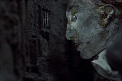
I had already unwittingly seen their work in a short animated sequence in the film Frida, where skeletons are working in Frida's imagination when she is admitted to hospital. The crude style of the animation, and knowing that the artists themselves have created this with such a hands-on, caring approach really brings the objects being filmed to life. The light manipulation and sound in this example as well, is particularly effective, bringing the scene a claustrophobic and unsettling atmosphere. 
Still from animation sequence in Frida.
Another piece they are well known for is their film Street of Crocodiles, which is also very creepy and dark in tone. The marriage of the image and the soundtrack is clearly very important. In my mind I'm already trying to think of musicians I know who might wish to collaborate with me if I was to make my own animations in the near-future. It is interesting to learn that the Quay brothers prefer to work with pre-recorded music, which I assume must dictate to a large extent how they construct the narrative of their animations....like a book illustrator responding to words with their visuals, they respond to the music as well as the story.
A still from Street of Crocodiles.
Recently I have realised that for my own work to develop in a way that can allow my love of drawing and craft to most effectively co-exist, I need to start integrating them more closely, rather than simply throwing 2d and 3d elements together. I noticed immediately that the Quay brothers have achieved this quite seamlessly in their set pieces...
The prowess in illustration and calligraphy seeps increasingly into many formal elements in their later films, evident as graphic embellishment in the set decoration, or their particular use of patterns in the puppets' costume design.
-Wikipedia

I feel like I've struggled to find artists to aspire to, who employ craftsmanship and drawing skills into their work, so it's been very exciting to make this (very late) disovery. 

Caitlin Hackett

One of our visits in New York was to see illustrator Caitlin Hackett in her apartment. A small group of us squeezed in, while she showed us some of her work displayed around her apartment, and some pieces of work in progress in her studio room.
Her drawings are ambitious and highly detailed...and so impressive! Her subject matter is quite dark, focusing mostly around mythical creatures. It seems ideally suited to epic fantasy stories; and in fact she did share with us some of her original drawings for a story book she was commissioned for.
Caitlin usually works using biro and watercolour. As we could see from a piece of her unfinished work on the wall, she sketches out the image in in pencil, then goes over it in pain-staking detail in biro. Although time consuming, the end results are stunning.

However, she explained frankly to us how her traditional method of image making was hard work when she was asked to change details of her illustrations for the story book. Rather than using some sort of high-tech solution to make quick alterations (as more digitally dependent artists may be able to), she had to completely re-do the drawing.
I thought it was interesting to see that, like André da Loba's studio, Caitlin's apartment and her studio room seemed to reflect her style of art work. The space was very neat and orderly, like the precise and clean look of her drawings, rather than the chaotic and overwhelming environment André worked in (which I thought corresponded nicely with his prolific nature and spontaneous ideas). She also had a beautiful cat that followed her around and observed as she showed us her studio!
Although the drawings were obviously the main focus of her talents, I was fascinated by some little puppets she had made.
Although these were more of a fun side-project for Caitlin, they have so much character and are so skillfully made! I don't know if it's just that I'm naturally inclined to admire 3d art work, but (I hesitate to say) I think I was drawn to these even more than the drawings. Rather than being a complete departure from her usual work, the detail painted on them is clearly in the same intricate style as her drawings. This visible link between her 2d and 3d creations is something I need to think about establishing in my own work, so I found these inspiring for that reason too.

Sunday 16 December 2012

Portfolio review with Foursight

Today Bryony and I went to see Jord and Dom (of Foursight). It's encouraging to see familiar faces making a name for themselves in the industry, and for the first time out of the college in their own studio!
It started well when they liked my portfolio folder; I've chosen a dark blue one that holds loose sheets of work, so people who view it can take it out/shuffle it around easily if they want to. It also meant I didn't have to worry about the order being too strict as making the work appear coherent with facing pages seemed a little challenging based on the body of work I've assembled so far. 

Overall both Dom and Jord were very complimentary about it.
Jord asked how I constructed the image, (looking at my image for Life Stories), so it's good to know there's hopefully a bit of mystery about it, if the methodology of my illustration isn't immediately obvious. I pointed out that I was a little insecure about including my 8 x 8 work, as I feel the drawings are weaker than they could have been, but they thought it was still effective.
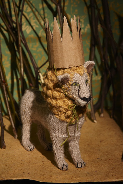
The piece that seemed to get the best reaction was Leon. I think this is easily the piece of work I would feel the most confident in showing off, because it shows my 'making' skills at their best. It seems to shine through how much I cared for and enjoyed creating this lion.
The final piece in my portfolio was 'Mini Monty', one of my first animal creations in this style. Again, I was tentative about the reaction I'd get about this because I was unable to get it photographed in the studio like the lion. But, as has been mentioned before when a graduate from our course had a look at my work, they quite liked how I had photographed him in a domestic context (with the kitchen for a background).
After they had looked at all the work in the portfolio, I asked if there was anything they thought shouldn't have been included, or wasn't very good. They couldn't pick out anything in particular to criticise. They thought that it showed off my two ways of working, and the main piece of advice was to continue making and producing images as much as possible, so that we will have plenty of strong work to choose from for our final portfolios when we graduate. 
Although I'm happy it seemed to go very well, I am slightly concerned that my portfolio divides my work into two very separate ways of working. My made animals stand well on their own as sculptural pieces, but I am hoping to integrate my drawing and making together in a stronger way, so that neither aspect appears forced or incongruent next to the other. I think I am capable of doing this, I just need more work that proves it in my portfolio!
Another memorable point that Jord made was that we would find it easier to make good work if we do what we really want to do. This struck a chord with me as I have always felt I work the best when I am able to make a strong personal connection to a project...if I am able to see a way into something that makes me really care for it, then the ideas start coming and I treat it as something special. I felt this way especially when I created 'Mini Monty', my lion, my totem, my picture for Life Stories and my work for Little White Lies (which I will add to my portfolio as soon as I'm able). 

Sunday 2 December 2012

Learning Drypoint

Last Thursday was my first time doing drypoint printing. I absolutely loved it!
I was given an aluminium plate and advised to be experimental for my first attempt-scratching into the metal using different tools at different pressures, trying to really get a feel for how to do it confidently.
I chose to copy a picture of a cat for my first try.
I was a little bit uncertain about how hard to press into the metal in relation to how dark the lines would come out, so I avoided doing too much detail in the cat itself, instead scratching out more detail for the bush behind it...and a few lines of what I thought might come out as tentative 'shading' here and there.
Once I had been shown the process it was fairly easy and I really enjoyed it....spreading the ink on, rubbing it in and polishing it off felt almost therapeutic.
I was surprised by how well the prints came out. I tried using different colours for the cat and the background. My favourites were some of the two-toned ones.
I can't wait to do another design on a new plate. Hopefully I will have time to do some designs for presents/Christmas cards. In the mean time I've been adding watercolour to some of the prints I thought needed something to bring them out a bit more.
I did another with orange and red coloured leaves but managed to get paint on the cat's leg by accident, so I cut out the cat from another one of the prints and stuck it (with a layer of cardboard) over the original image.
I like how this gives the cat a little bit more definition (and a tiny bit of a 3D effect).

Sunday 18 November 2012

Zine project work in progress

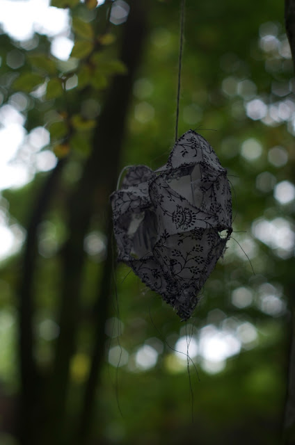
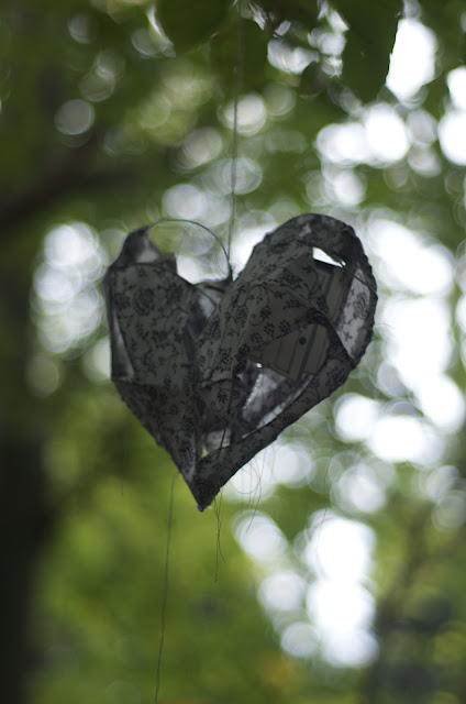
As our zines were meant to be related to our personal projects, I decided that some of the content of mine should be made up of photographs of my dream heart cages, as I had begun over summer (see previous post here). I managed to create three in total. Initially the obvious option for photographing them was to use the studio at college, as I have done for previous projects, but it seemed like quite a sterile environment to put the objects in. I asked for my friend Tom (a photography student) to help me go out and take pictures of them in an environment where I could hang them from tree branches. This background helps to create a more dreamy atmosphere for the hearts; coordinates with the flower pattern on the fabric; and in my mind helps to symbolise that the dreams themselves are a natural and mysterious phenomenon.

Due to time restraints on both sides, we ended up with very limited time to go out and get the photos done. We also found that it was very difficult to stop the hearts from spinning round once I had hung them up! Tom managed to get some good shots though. It was slightly problematic photographing the hearts to look good as objects, as well as making sure that the angle revealed the images inside them. As this project is still not officially assessed until our module deadline at Christmas, I'm keen to experiment more with some close-ups that focus on the drawings inside, as well as more of the hearts from a distance.

I will also need time to add further content to the zine itself, so that it doesn't simply become a book full of photos...but it would still be nice to keep a little side-project booklet of the photos on their own, seeing as the sculptures took a lot of time and effort to complete!

Missing feline company

Today I have suddenly realised just how much I miss my cat. Strangely enough, she is one of the most encouraging individuals when it comes to my work. At home in York when I'm making/drawing something she will always be there watching, inspecting everything, occasionally sitting herself right on top of something when it's clear I'm not giving her enough attention...generally being friendly and attentive company. There's something quite lonely about Manchester without having a Molly wandering around the house.
Molly joining Anna for lunch.

Leon the Lion

My lion had been sitting unfinished for quite some time until one day I decided to finish him properly. He is now a proud resident on our work desk at home. 

New York book shopping

The highlight of my shopping in the city was definitely our visit to The Strand bookstore. It had three floors- two separate ones for art books and rare books. Most of my spending money went on purchases there; it was hard to resist when there was so much choice and mostly much cheaper than books tend to be back here in England. 

Friday 16 November 2012

André da Loba

Our first class visit in New York was to see André da Loba at the shared studio building The Invisible Dog in Brooklyn. 
We started by viewing the exhibition Shaboygen by Steven and William Ladd, which covered the bottom floor of the building. 
These strange bead trees were my favourite feature in the room. Unlike some of the other pieces, which just looked like boxes of trinkets or decorative fabric arrangements, these had more mystery about them...perhaps more of a story to tell. I wonder why the artists chose to make these tree shapes out of the beads; were they portraying a particular scene or environment? Their formation interests the viewer and you subconsciously try and attach more of a story/purpose to them. 
...followed by a lift up to the studio floor (a huge lift like none other I've ever been in!)...
...and slowly the entire group took turns to cram into André da Loba's studio, where he let us take pictures and be nosey in general...
These little men were some of my favourite things in the studio- they remind me of a papier mache wise man my dad made at school when he was little.
I could have stayed for hours in this room! It seemed like a real-life tour of André's imagination. There was so much work to see, so many creations and characters, different ideas everywhere you looked!
 ...Afterwards we went up to the next floor where there was another exhibition and we all got to rest our legs a little while as André gave us a performance displaying his work. We went away feeling very inspired!
Here is a video performance of his, Zeitgeist, that includes some of the same pieces.
I made some notes at the time:
That was a great first day!