Friday, 16 November 2012

André da Loba

Our first class visit in New York was to see André da Loba at the shared studio building The Invisible Dog in Brooklyn. 
We started by viewing the exhibition Shaboygen by Steven and William Ladd, which covered the bottom floor of the building. 
These strange bead trees were my favourite feature in the room. Unlike some of the other pieces, which just looked like boxes of trinkets or decorative fabric arrangements, these had more mystery about them...perhaps more of a story to tell. I wonder why the artists chose to make these tree shapes out of the beads; were they portraying a particular scene or environment? Their formation interests the viewer and you subconsciously try and attach more of a story/purpose to them. 
...followed by a lift up to the studio floor (a huge lift like none other I've ever been in!)...
...and slowly the entire group took turns to cram into André da Loba's studio, where he let us take pictures and be nosey in general...
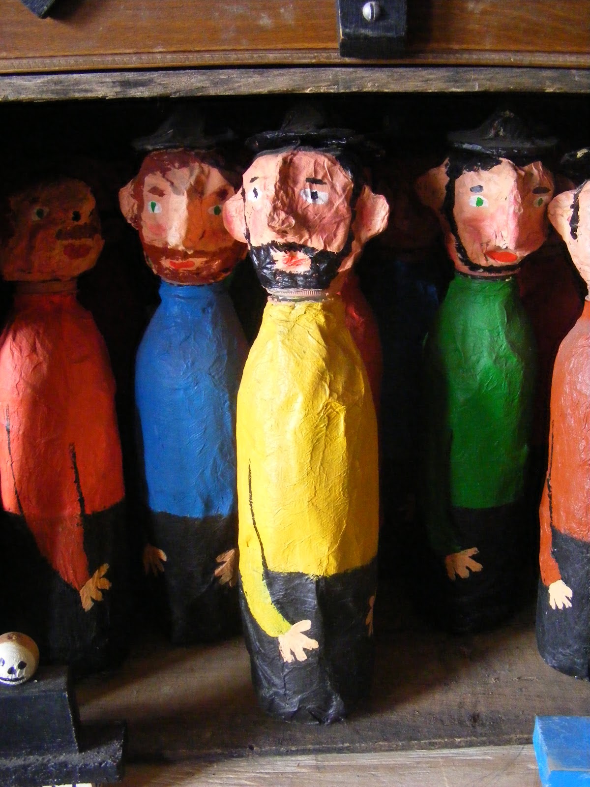
These little men were some of my favourite things in the studio- they remind me of a papier mache wise man my dad made at school when he was little.
I could have stayed for hours in this room! It seemed like a real-life tour of André's imagination. There was so much work to see, so many creations and characters, different ideas everywhere you looked!
 ...Afterwards we went up to the next floor where there was another exhibition and we all got to rest our legs a little while as André gave us a performance displaying his work. We went away feeling very inspired!
Here is a video performance of his, Zeitgeist, that includes some of the same pieces.
I made some notes at the time:
That was a great first day!

New York, New York!

Last Saturday we arrived back to a dreary Stockport afternoon, extremely jealous of all our classmates ringing their parents for lifts home. However, suffering jet-lag for the best part of a few days and paying for an expensive taxi ride home all on our own was all worth it for the amazing week we had! 

This was my first time visiting America, and the streets of Manhattan were far more overwhelming than I had anticipated...it certainly brought out childish excitement being somewhere I'd seen so much in films and was finally experiencing first hand. For the most part the people were extremely friendly and welcoming. I had been scared that the effects of hurricane Sandy would still have been causing a lot of stress for people in the area, but apart from a few fallen trees in some places we visited, it was (bizarrely) almost as though it had never happened. Clearly New York is a very bustling place and managed the clean-up very efficiently, for the sake of carrying on as normal as quickly as possible, making it strange to think we were getting scared that our trip would have to be cancelled. More than the storm causing problems with our schedule in the city, I was concerned that visiting and expecting New Yorkers to be hospitable and enthusiastic about our visit was going to be completely inappropriate; but it seems that those fears were unnecessary and our tutors guided us around some very inspiring visits with people from the industry who seemed very happy to meet us and welcome us into their homes/studios.

The highlights of my week were visiting illustrators Andre da Loba (at his studio) and Caitlin Hackett (in her apartment!). We also got to wander around the fascinating house of Stephen Byram as he told us about his work. 
 
Of course we also spent much of our time travelling around the streets of the city, and underground on the subway. The last day, in particular, gave us an opportunity to indulge in a bit of pure tourism. We wandered around Central Park then went up to 'the top of the rock', spying on the city from the top of the Rockafeller, and in our last spare minutes returned back to the park to see the sun set before we had to board the coach to leave- such a perfect way to end the trip, but we were very sad to go.

Saturday, 22 September 2012

New Pet

A wood-carved duck I bought from a market stall, isn't it beautiful!
Afterwards I went with Bryony for a hot vimto date at the Nexus Art Cafe and drew him along with my yellow rose...

'Potential Dream Subjects'

The content of our zine for this brief is meant to be inspired by our personal projects. Initially I got a little carried away with my ideas for how I'd love to fill a zine...veering off from the dream theme that I need to focus on. So, I'm reigning in my excitement and trying to produce content that is a little more focused and appropriate...

Using one of the blank books I have made, I've started to create a zine of portraits. The portraits will be a mixture of life/memory and from photos I've taken- in other words, people through my eyes. Either people I know well, or the ones I will (hopefully be brave enough to) draw sneakily from a distance are part of my everyday experiences...and the extent that they affect me won't be evident until I dream. All the people I see are potentially dream subjects, so this is the theme of the zine. If it's successful, I hope the drawings themselves may even be a vague indicator of how these people might appear to me in dreams- perhaps the people I take the attention to draw in more detail are in turn more significant in dreams, and more vivid in appearance.

Here is my first page, a sketch of my housemate Bryony, sitting in the sofa room at college:


Zine Project

Our current project is to create our own zines.
We were briefed at the Nexus Art Cafe in town, which houses the Salford Zine Museum. I'd never been here before- it's amazing all the places in Manchester I've not yet discovered (and really need to!), mostly all hidden away in basements like this one.

After an impressive hot chocolate (with a great load of cream on top) I picked out a few zines from the library they have there. There's a mix of really diverse styles, and it was inspiring to read examples that triggered lots of ideas of what I would love to use as zine content myself. I kept a note of these ideas as I was reading...

It was also encouraging to see a lot of the content appeared to have been quickly produced-almost doodling style-and rather than looking unprofessional this corresponds aesthetically with the humour.

The images above are from the zine 'Future Fantasteek!' (issue 13, July 2012). The first thing that attracted me to this one was the black inky creature on the cover (with the googly eyes). I didn't get a photo of the cover, stupidly...but you can see it on the virtual preview of the issue on the website.
The content in general appealed to me because of its humorous and quite satirical tone- the content   is opinionated illustrations of familiar thoughts and situations, and appears to be quite a personal showcase of the artist's ideas based on their experiences of people. It's an absorbing read as I'm sure most readers can identify with a great deal of it and (fellow artists in particular) will probably become inspired to conjure up their own anecdotes for similar ideas.

In terms of crafting a zine, this one was particularly interesting- a painted character is seen from front and back view on different sides of tracing paper! The use of different coloured card and bold block colors with screen-printed designs made up a very graphic looking, picture based publication.
Unfortunately it was very difficult to tell what the title of this zine was...on the cover it was labelled 'Extensas Estrias Del Esten Sinor', and I couldn't spot any details of a website/artist details, so it remains a bit of a mystery. If anyone can save me from my ignorance please inform me immediately!

Year 3, here we go!

September has marked the start back at college, a new studio room and a new set of classmates who have merged with us from surface design. We have made ourselves at home in our new space with a new set of rules-signs that we created for a one day brief, assisted by the illustrator Darren Newman, who has a great flair for creative typography.
As a class we split into groups and thought up suggestions for some studio rules, then as a group voted for the ones we thought were the best. The winning rules were then divided up randomly between the groups and we had to create a sign or them. Bryony and I were dealt "Don't be a knob."
After getting over the initial awkwardness, we decided that we would go all out and create something appropriately audacious (as was only fitting, with the tone of our rule...we hope).
Here is the result: