Showing posts with label research. Show all posts

Tuesday, 30 April 2013

Keeping in touch with what inspires me...

At this late stage I'm hurriedly planning the size and layout of my book. In my initial storyboards of my images I automatically drew out rough boxes in quite a 'wide-screen' film friendly format. I'm not entirely sure why I did this, but I seem to be naturally comfortable thinking of images in terms of being a scene, like a landscape camera shot. I've needed to reconsider this as it isn't properly taking advantage of the book format. In my talks with tutors it has also been brought up that I should aim to create something that appeals to the child in me; something I can really connect to. So, I've been looking at the books I enjoy the layout of for inspiration. My favourites are old storybooks that appear quite decorative in their design, such as this collection, the Nutshell Library by Maurice Sendak:
Here the illustrations are linked comfortably with the text in the book with decorative flourishes, either around the images themselves or alonside them around the titles. Everything looks neat and cohesive, which is what I want to be able to achieve! I think the size of these books is also a big factor in their appeal. They feel like precious objects as they are so small, and reading them is a personal, private experience (not particularly suited to sharing). Until I have taken the photographs of my scenes I can't finalise what size I would like the illustrations to be exactly, but I'm hoping they will be suitable to be viewed as quite small, similar to this.

Monday, 8 April 2013

Wonderful Inspiration

Just as the thought of creating my own animation was becoming too daunting to bear, I found this wonderful animated adaptation of The Grimm Brothers' The Golden Bird by Cat Bruce:
[Click here to watch it on Vimeo!]
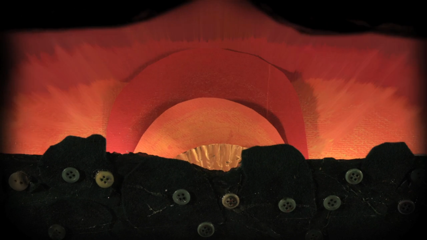
The scenery has been created quite crudely, but it nevertheless looks atmospheric and appropriate for the characters, mostly due to the lighting effect. She has used real bits of plantation: twigs and dead leaves; large pieces of fabric and buttons.
The sun has been represented by a circle of golden foil. The sunset is a simple sequence where fabric is pulled down behind the foreground to show the transfer from sunset to night sky.
The house in the opening scene is constructed with corrugated card, and cardboard is also used as silhoette detail in the foreground of the shot. Cardboard trees appear to be coloured with oil pastel. Although quite a simplistic representation of objects, the material is appropriate and comfortable alongside the made figure of the man.
Another aspect of this that I found particularly encouraging in relation to making my own animation is the way she has used a 2D representation of the man in a sequence where he is chasing after the golden bird. In this 'long shot' the puppet is used to achieve more realistic running motions. The background moves to the left to give the illusion of his speed.
I like the way she also uses frames focusing closer on the character intermittently during the chase, focusing on his struggle to keep up as we hear his voice. The sequence, and the way the rest of the animation's narrative appears, gives the impression of effective, 'filmic' editing.
Other impressive features include:
this fantastic fox...
the man's face!...
and this fire, complete with flickering flames and sparks (so clever I don't even want to think too hard about how it's been done)...

Visiting Germany

Last week I went with my family to a peaceful little village in Germany called Dießen, just by the lake Ammersee. We were visiting my cousin's new baby for the first time! He was lovely.
Rather than otherwise seeing the trip as a holiday, I tried my best to make most of the time there useful for my work. It was a perfect location for 'sense of place' research (for the setting of Little Red Riding Hood), as my aunt's house is a short walk away from some woods. The bizarre weather we've been experiencing this month in England has been equally as strange abroad. The cold weather had lead to snowfall: and although the sunshine gradually melted what blanketed the garden when we first arrived, the woods remained a strange, unseasonal winter wonderland.
[The view from my auntie's window]
It was such a quiet day when I went wandering on my own. I didn't see any people, bar a few cars driving past as I crossed the main roads. I was even lucky enough to encounter three fawns as I made my way up towards the hill entering the woods. I only just managed to get my camera out in time to snap them as they dashed out in front of me.
[deer!]
Walking up the slope, I was stepping over sledge tracks, and I suddenly realised this was where we had been sledging as children years before, and the nostalgia spurred me on (as I struggled not to slip during the climb!) Once I got into the trees I sat down a while to enjoy the scenery (leading to grass-stained jeans), and got out the camera again. I'm the first to admit that my photography skills unfortunately don't do justice to what I could see that day, but the pictures will no doubt be helpful. I also gathered together some of the odd loose branches and twigs I could find on the ground, as I've decided I would like to use some natural found materials to help build up the scenes for some of my illustrations. In my mind it felt more special using twigs from these woods than any old trees back in Manchester (yet my bundle of German sticks remains at home in York with my parents, when I realised I couldn't manage them on top of the rest of my luggage on the train. Hopefully I will be reunited with them in time to put them to use still...)
I even spied 'grandma's cottage' across the way...
Returning home with completely numb fingers, I felt rejuvenated by this little excursion, and set back to work in the warmth of the indoors. 

Wednesday, 19 December 2012

'What does Illustration mean?'

Over the years of being on this course, the same question has popped up again and again: what even is illustration? It's quite a hard discipline to pin down with a neat definition.

Surprisingly (to me anyway) a lot of people, besides being able to describe it articulately, don't seem to have a clue what it is. I often have to add "it's an art course" when I explain to people what I do. Other people have immediately assumed I'm going to design tattoos...and it seems the most confusing of all when I try to explain that my style of illustration is based around making things that I photograph.

Traditionally, I would have always thought of the drawings or paintings in story books, etchings in old-fashioned newspapers...that sort of thing. Nowadays, the world of illustration has opened up to a variety of different approaches and uses. The boundaries between illustration and craft, illustration and fine art, illustration and graphics, illustration and photography...(etc)...all seem to be blurring. Illustration is no longer confined to drawing, and often good draughtsmanship isn't even necessary; it is the art of creating an image. Modern illustrators are usually expected to be capable with computer programs to process, refine or transfer their work. With the ever increasing pace of technology development, there is pressure to adapt to the newest gadgets with the way we approach our work. However, that is not to say that traditional skills and techniques have gone out of the window. A lot of illustrators create work that can be as simple as pencil drawn scenery. Craft-based art work has become trendy recently too.

A very simplistic way to describe illustration is the enhancement or expansion of a story/idea visually. The illustrator's job is to make something accessible; particularly in the world of editorials where the image can be used to draw a reader in. In children's story books the illustrations are often the most important part; it tells the story visually for children who are still learning to read; (and of course even more so in picture books). More weight is placed in the meaning of the images in this context, as the illustrator's style has a very strong role in defining the tone of the story. In adult books the illustrations are not essential, but serve to enrich the text...and perhaps offer an alternative viewpoint into the story. They can be very subjective depending on the illustrator's style or how abstract they may choose to make an image. They are not mere diagrams of the events being described; they are an offering of the world created by the words. The saying 'a picture is worth a thousand words' is true.

Illustration may not necessarily tell a story either; it can be a purely decorative art form- used for various forms of merchandise and clothing etc...to make something look attractive. Many working illustrators rely on this to sell their work independently; to sell their work online or at craft fairs etc. Try and imagine a world without illustration and I don't think anyone could envision quite how dull it would be.

To conclude, I've had a quick look around to see what other people think.
Wikipedia has quite a concise definition that I like:
An illustration is a depiction that is created to elucidate or dictate sensual information.
Also, David Apatoff, an art blogger, has written an interesting post about the distinction between fine art and illustration here, which offers quite a comprehensive argument on what illustration is.

Monday, 17 December 2012

The Quay brothers

Recently I have been introduced to this very interesting pair of artists, the identical twins Stephen and Timothy. They are most famous for their stop motion animated films, a medium they progressed into after many years as professional illustrators, producing drawings and etchings with the same dark visual language as their 3d puppets and sets. It is their ability to apply their style to many diverse mediums that has made them such inspirational figures for me. I can see them heavily influencing the direction I will choose to take my work after Christmas for my final major project.

I had already unwittingly seen their work in a short animated sequence in the film Frida, where skeletons are working in Frida's imagination when she is admitted to hospital. The crude style of the animation, and knowing that the artists themselves have created this with such a hands-on, caring approach really brings the objects being filmed to life. The light manipulation and sound in this example as well, is particularly effective, bringing the scene a claustrophobic and unsettling atmosphere. 
Still from animation sequence in Frida.
Another piece they are well known for is their film Street of Crocodiles, which is also very creepy and dark in tone. The marriage of the image and the soundtrack is clearly very important. In my mind I'm already trying to think of musicians I know who might wish to collaborate with me if I was to make my own animations in the near-future. It is interesting to learn that the Quay brothers prefer to work with pre-recorded music, which I assume must dictate to a large extent how they construct the narrative of their animations....like a book illustrator responding to words with their visuals, they respond to the music as well as the story.
A still from Street of Crocodiles.
Recently I have realised that for my own work to develop in a way that can allow my love of drawing and craft to most effectively co-exist, I need to start integrating them more closely, rather than simply throwing 2d and 3d elements together. I noticed immediately that the Quay brothers have achieved this quite seamlessly in their set pieces...
The prowess in illustration and calligraphy seeps increasingly into many formal elements in their later films, evident as graphic embellishment in the set decoration, or their particular use of patterns in the puppets' costume design.
-Wikipedia

I feel like I've struggled to find artists to aspire to, who employ craftsmanship and drawing skills into their work, so it's been very exciting to make this (very late) disovery. 

Sunday, 22 July 2012

funny little animation...

What a brilliant piece of work!
Sadly, I have no idea who made this, but it has so much character. It looks almost like a Quentin Blake illustration brought to life. 
(I hope I haven't just made the ignorant mistake of not knowing this is in fact by Quentin Blake...)

Friday, 13 July 2012

Izziyana Suhaimi

I have recently become a little bit obsessed with this wonderful artist Izziyana Suhaimi.
Her work is unique and distinctive, and something I can relate very strongly to.
Here are some examples of her pieces that caught my eye:
I think there is always something to be said for the simplicity of a good quality pencil drawing. I'm impressed with the way Izziyana has embellished her illustrations (with the dreamy watercolour backgrounds, and detailed colour popping embroidery) without 'refining' her drawings any further. It gives the images a raw and honest quality...and I admire this in the way it lays the artist quite bare- we can see exactly where her hands have been on the paper, the embroidery she has done with her own hands, the original pencil marks she has made, unclouded by the use of technology.

On her blog she states:
I am attracted to the evidence of the hand and its time-consuming aspect, which runs counter to the instant gratification and mass-production centred age of today.
I couldn't agree with this more! Her work certainly does suggest this work ethic- it is very detailed and appears very carefully and lovingly done, not a stitch/pencil line/brush stroke out of place. There is definitely a reward in work that takes such time and dedication, because (in my opinion) it does stand out a mile from the hum-drum of illustration images around us today.
It's encouraging that other people seem to see this too, and Izziyana has been able to apply her work commercially through various interesting collaborations, including working with the creative team on a cover of the independent magazine, Catalog.
The mixture of photo, drawn and embroidered imagery looks surprisingly natural in these images, and not busy or clashing at all. Again, the bold colour of the thread is what really sets off the image, and the overall effectiveness is achieved through the knowing the careful balance of the three elements- the photo, pencil and thread are joined seamlessly.

Here's two interesting little interviews I found through a couple of blogs:

I know I'll definitely be keeping an eye on this lady's work...

Sunday, 29 April 2012

The first time I saw Shrigley...

Opening titles of Hallam Foe. (2007, David Mackenzie, UK, 91 mins.)
Animation by David Shrigley.

Thursday, 26 April 2012

Winter's Bone

I just stumbled across a short review I did of Winter's Bone last year. We went to Cornerhouse to view it with the rest of our critical studies group. It's an excellent film that kick-started the now flourishing career of Jennifer Lawrence, who has since starred in X-Men: First Class and The Hunger Games.
Click here for the official trailer.


Analysing and evaluating films as works of art: Winter’s Bone
(CAUTION: CONTAINS SPOILERS!)


The synopsis of the film highlighted the predominantly negative themes, and after reading it I was worried the film would be so depressing that it would be an entirely unpleasant viewing experience. However, the story had a surprisingly enduring sense of hope, and the determined struggle of the protagonist, the hardened mountain girl Ree Dolly (Jennifer Lawrence), was completely absorbing, along with the beautifully shot landscape.


The story centres around Ree’s desperate effort to support her family, who have been abandoned by their ‘crank’ manufacturing father and face the loss of their home if he fails to show up in court. Seventeen year-old Ree faces the daunting challenges of acting as a mother for her younger siblings as well as a carer for her incapable, emotionally withdrawn mother. Now she also faces the quest to find her father before his absence ruins everything.


The culture which is explored in the film reveals a tough, poor way of life. They are almost like a forgotten race, surrounded by the haunting beauty of rural America, where the law is ignored and the people live off the land. In contrast to the usual society revealed by American cinema, the characters find value and purpose in little but their family and their homes. The importance of family is evident throughout the film, e.g. in the way Ree’s presence is often only accepted when she announces she is the daughter of Jessup Dolly, a man whose name is infamous because of his dangerous involvement in the local drug trade. Her loyalty to her father is also subtly evident, despite his abandonment of his family.

Most of the characters in the film begin by showing a ‘tough love’ attitude towards Ree. The locals are mostly all aware that Jessup has been killed, but try to protect Ree from finding out. In her various visits around the mountain people, she encounters intimidating and violent characters, which gives the film an imposing sense of danger and unpredictability e.g. when Ree visits Teardrop (Jessup’s brother) he becomes violent towards her and his wife upon Ree’s insistence that he help her find Jessup.

In the opening scenes a muted, naturalistic colour scheme is quickly established, reflecting the barren and cold atmosphere which is shown literally, in the mountain terrain setting, as well as the grim, sombre mood of the film. The main colour which stood out from the mise-en-scene was a cool blue, e.g. blue cars, blue clothes, water. Blue can be symbolic of depression and coldness, two words which are extremely relevant in this context. It can also be associated with knowledge, something which Ree is searching for in the form of her father’s whereabouts. There is also a fair amount of warm yellow, suggesting the natural glow of firelight, mostly in indoor scenes.

There was very little non-diegetic sound, in-keeping with the rural natural feel of the film, although it was sometimes employed to intensify what was happening on screen, which worked particularly well in dramatising events because of the general lack of music.

The end scene of the film was in my opinion the most poignant. Teardrop shows his tender side as he visits Ree and her family, and plays them a tune on his brother’s old instrument. He indicates to Ree that he has found out who his brother’s killer was, and in the quiet understanding between him and Ree it is suggested that he is going to avenge Jessup, and in that case may never see them again.

Saturday, 21 April 2012

A lecture from Jon Hill

I found this lecture very inspiring, despite it probably having more relevance to graphic design.

Jon Hill is the design editor of the times, and he came in to discuss with the design students why working for a newspaper may be worthwhile in the future...

His career has changed throughout the years; ranging from work as a junior designer to being the design editor of the times. It sounds like a daunting job to be able to achieve, from our perspective, but it shows how big things can happen when you take all the opportunities you can.

He discussed how becoming as a junior designer (at Atelier Works) consisted mostly of basic office tasks; making tea for other staff, mounting work etc. However, his hard work paid off when he got the apprenticeship there. Later, as a senior designer at Esterson Associates he had the freedom to do more varied design work, working on various books and newspaper projects.

After starting a family he was self-employed and worked from the attic at his home in Wilmslow. His experience working in London meant that he still had a lot of business from the connections he had made, but he was able to work alone from home instead.

But the most dramatic career change came when he accepted a job as the design editor of the times, changing his work environment from a little personal space to a huge corporate building. Around 2006 Hill was involved when Neville Brody wanted to re-design the Times for its new, more compact size. It was then that the font 'Times Modern' was designed for it, pictures were changed to colour, and more consideration went into the layout for the double page spreads- it became a little more daring (e.g. images were sometimes used within text, to highlight the information, 'a bit like a magazine').

Hill described how the hierarchal structure of the newspaper was a bit like a government. As the design editor, he is quite high up, near to the top, with the editor James Harding. However, the structure changed so that more employees were encouraged to merge together and explore different disciplines together.

He showed us an example of an unusual layout, to show how the design of stories had become so much more of an important element. In this case, the Chilean miners story was presented as a large double page diagram. The curved line around the edge was drawn to be the actual size of the pods the miners were in, making an interactive feature if the reader were to put the newspaper on the floor and see for themselves.

Hill was also very enthusiastic about special issues of the newspaper supplement magazine, such as the Obama election story, the death of Michael Jackson and Prince Wiliam's wedding to Kate Middeton. With these stories the designers have the excuse to be particularly extravagant and go 'overboard' with their work. He also mentioned their monthly science magazine, 'Eureka', which the graphics are also particularly important in, to make the content accessible and fun for the general public. They make it as 'consumable as possible'.

In light of the constant digital advancements happening so rapidly recently, Newspaper circulation is on the decline. The Times have kept up-to-date with this. Hill told us how his office were shown some of the first ever editions of the IPad. It was all very strict and top secret. The Times had to be designed to fit the new IPad app, for the readers who would want to access it this way. Although the Times would now be available as a newspaper, website and IPad app (as animated, interactive articles), it was still the 'same ingredients' for all three platforms. They just work hard to stay as modern and relevant as they can.

Hill's final words of advice were: take every opportunity for experience as you can- it may lead onto your career. And in response to how illustrators were commissioned, he stressed that they look for people based on their appropriateness for the story, and their ability to generate ideas. As editorial work is usually the best way to get into the industry, hopefully I can do what the professionals advise and try my best to pick up opportunities that come my way in the near future!

Tuesday, 10 April 2012

A handmade object is a thing with a soul.
-Kristina Sabaite

Wednesday, 14 March 2012

'Systems' by Dan Beckemeyer

I was immediately struck by this piece when I first saw it. Beckemeyer has shown how 2D and 3D working methods can be combined so elegantly! I am fascinated by the felted wool used for the muscular structure- it sits so well with the hand-made paper and the ink drawing- very organic looking which couldn't be more appropriate for the subject.