Showing posts with label Little White Lies. Show all posts

Sunday, 21 July 2013

Little White Lies Competition

I was very excited to hear that the magazine Little White Lies (which I have previously done a competition brief for) is running a competition to design a poster for the up-coming film Only God Forgives, directed by Nicolas Winding Refn.

(see the details here)

It's keeping me busy at the moment! I only wish the film was out already. I've been watching the trailers repeatedly for reference:
...and the latest edition of Empire Magazine also has quite a revealing article on it. The brief says 'We're looking for the most interesting and unique designs, something that captures the tone of the film.', so I'm trying to think of unusual ways to get across the feel of it. So far I've decided on one important thing: the main character's hands are very important.
In the Empire article it says:
'The star is a man of few words...in Drive, his soulful stunt-driver spoke with his boot heels and wheels. In Only God Forgives, it's all about his hands.'
I also found a post on Tumblr with a quote from Nicolas Winding Refn (along with these gifs) about the importance of the hands:
'The first image in the movie that I ever came up with for the film was this—I thought well, I want to do a fight movie and I started looking at my hands. And if you look at your hands like a tight fist—it’s obviously like a very sexual aura. It’s like a very sexual image. Like all men’s extension of their sexuality: violence. But if you open your palm, it’s about submission. And I thought: “God, there’s a movie in this movement.” '
 ...so, I know that Ryan Goslings fists, and this gesture that Refn's fascinated by, will be something essential to focus on. Immediately the thought of building wire hands flashed into my mind. Will I use 3D elements here? I'm not sure how I could make it work.

Another important element I'm considering in relation to the design is the setting: Bangkok. The city is reminiscent of The LA location of Drive, but somehow much more surreal. Visually, the film seems unnatural; full of neon lighting contrasting to the dark of rooms or night-time streets. It reflects the trashy side of the city's criminal underworld which Ryan Gosling's character seems to exist in, but it also looks dream-like and hypnotising. Colour will be something else to think carefully about, and not something I can work particularly confidently with. But I like a challenge!

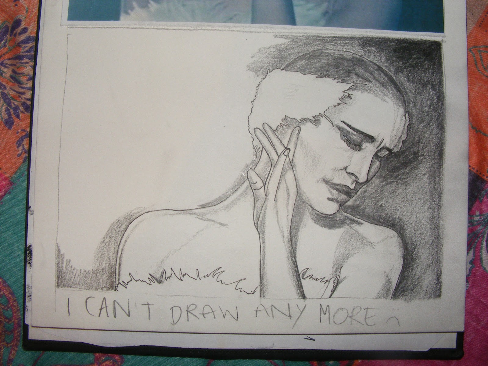
Today I've been working on a drawing of the character to get me started, using painted ink, pencil and pen. Here's a quick look at it in progress. I hope it resembles who it's supposed to...
 
 
 ...and some more progress...
...and the finished drawing. I was thinking it might look good with a simple red, bold font with the film title inbetween his arms over the image. But sadly I don't have photoshop to complete this simple task at the moment. And I was too late to enter the competition also, which is a shame. But I'm happy with the image.
 

Sunday, 20 May 2012

Final Photos of my Swan

I am so pleased with how these final photos looked. I took these using my own camera in the white 'bath tub' from the photography department, using one of their lights.
(Unfortunately I managed to lose the copies I made which i dropped into the Little White Lies cover template- I will upload these if I manage to get hold of them!)

Sunday, 6 May 2012

Little White Lies (further, and very late) progression.

Finally I have allowed myself a little time to bring together my work for this brief. Last Friday's studio day was spent drawing away, studies of Natalie Portman's character from Black Swan again. I've done emulsion transfers of a  few of these and they came out really nicely- a hazy, slightly bluer effect than the original pencil and ink drawings.
Today I'm continuing with my drawings, and tomorrow will make a trip into college to get some photocopying of these done, ready for more transfers. I need a few more drawings to sew into/onto the wire structure of the swan I've made. I will be leaving it partly exposed with key quotes from the film sewn into the interior, so that you can look inside the swan to read these. Annoyingly, I had pre-made lots of carefully cut out feathers to sew to the swan, painted with black ink, and these seem to have mysteriously disappeared. I will have to do a frantic search for those or make some more.
It's probably a little late to be worrying too much about this, but I'm slightly concerned that this work will lose a lot of its impact when it is transferred into a 2D format. As I'm unable to get the help of the photography department to photograph at the moment, I will be attempting to get a decent photograph of the sculpture to use in my cover design. Hopefully it will work well enough, but I can't stop thinking how much better this will probably look as it is- i.e. viewed in person, as an object. Perhaps my work is evolving into something more suited to installation art work? I'm not sure if I like this or not....
Something for me to ponder over...

Wednesday, 7 March 2012

A Sudden Improvement

Today's plan is to carry on with as much drawing as possible. Yesterday I sat myself down and did some drawing with Blackadder in the background and managed to do some work I was actually proud of. I hope I can continue to feel 'in the zone' this morning.
My most recent drawing in progress. 
3b pencil and fine line pen.

Sunday, 4 March 2012

Struggling!

Since coming home to York, I've been trying to keep up with the work I am currently falling behind on. But, frustratingly, I can't seem to be able to relax enough to draw as well as I normally do. I'm trying to finish some drawings of Natalie Portman, but I can't get her face quite right at the moment. And I'm probably worrying about being far too meticulous, but I want it to look right. I've already got the drawing I am so happy with, and feel actually looks like her, and now I want all the other ones to follow suit...which is admittedly easier said than done.
Study of Nina in progress. Pure graphite pencil and uni-ball pen.

Thursday, 23 February 2012

Cancelled photo session.

Last night I stayed up late trying desperately to pull my work together in time for it to be photographed in the studio today, but unfortunately I had to accept defeat, so today I will be going in to college to cancel my session. My work motivation has been stunted by an upsetting weekend...it's a shame I seem to have gained my focus back that little bit too late. However, the deadline is still a little while away, so I will continue my sculpture and the drawings to go on it over the weekend, then do my best to photograph it nicely myself. The college deadline and competition deadline is different (the competition doesn't close until 9th March, so hopefully I might even have time to work with the photography department before then, but I'm not getting my hopes up too high.
Here is how the wire sculpture was looking yesterday:
After posting the above photo on my Tumblr blog, I was flattered to get it reblogged and compared to Alexander Calder!

Wednesday, 15 February 2012

You'd think I'd be getting sick of her face by now...

another peek into my sketchbook...
The first page of my sketchbook....just doodling really, usually the best way to notice a few interesting ideas for me.

A crude plan of the idea I'm going ahead with.

A time-consuming struggle to get her face perfectly right. I was so happy with the bottom half of this sketch!

My most successful drawing so far plus colour and transfer experiments.

Sunday, 5 February 2012

Little White Lies brief progression

I now have an idea that I am happy with, and is in the early stages of development.
Initially I was reluctant to go ahead with it as it will be a 3d structure again, similar to what I made for my Totem. I was worried that this might be inappropriate for the brief, as it strays quite far away from how a typical portrait would look, and is definitely very different from the examples of covers on previous issues of the magazine. However, after I little encouragement from my tutor, I've decided to go ahead with this plan, in the hope that they might take a shine to something a little bit different!

So, like my Totem, I will be creating a structure; this time in the shape of a swan, with imagery (of Nina) on paper sewn onto it. Here was how the idea looked roughly in my head when it first came to life:
So far I've been putting off beginning making the swan, partly because it seems like a daunting task at the moment (an essay on postmodernism needs some serious attention), and partly because I'm not sure how big to make it. My tutor also mentioned a simple way of making it easy to fit the right scale when I'm using 3d- make a frame the exact size of the required dimensions (or to the right proportions) to fit things into so that when I photograph the work it should be easy to fit to the Little White Lies cover template.

I've been continuing some studies of Nina, mostly using film stills, which has reminded me of how much I enjoyed doing studies of Amelie screen shots last year, using watercolour and ink.
Amelie screen shot studies.

Black Swan screen shot studies.

Monday, 23 January 2012

'Little White Lies' Brief

My current project is very exciting. I am designing a cover illustration for the film magazine Little White Lies to enter into the competition. My design will be a portrait of Nina Seyers, the main character of Black Swan.
So far my research has involved re-watching the film, making notes on the atmosphere, themes and looking closely at Nina's character; attributes that may be relevant to the design. I've also watched and read various interviews that offer others' insights into the film and Nina. Natalie Portman's own words have been particularly useful:
"Nina starts out as this childlike woman, trying to please her mother, trying to please her ballet director and fit exactly into the standards of this world that’s prescribed to her. Finally she finds that perfection only lies in pleasing herself." 
-Telegraph interview, January 23rd 2012 
I've also been paying attention to the existing covers shown on the digital archive of the Little White Lies site. After a brief look it seems clear that the preferred style is quite graphic looking. Some of the examples had more of a hand-drawn feel though, but often mixed with digital imagery, such as The Life Aquatic Issue, where Bill Murray's face appears hand drawn in a sketchy style, combined with bold, colourful graphic clothing.
Another I was drawn to was the Drive issue, which would appear to be a very simple, yet skillfully painted watercolour.

I'm trying not to focus too much on existing film posters and magazine covers on Black Swan, as there is so much imagery already available, I'd like mine to be as unique as I can manage! At the moment I'm continuing to immerse myself in as much research as I can relating to the film and character, as well as beginning to do some drawings. Here is my first attempt at a sketch of her: