Showing posts with label 'On the March'. Show all posts

Thursday, 3 November 2011

Banner in progress

I began by painting out the shark on a piece of large black fabric, using undiluted acrylic and a huge brush. I tried to paint as quickly as possible to avoid over-blending and caking too much paint on, keeping in mind how effective Ed Hall's paint work had looked when it wasn't done 'perfectly'.

Once the shark was finished I cut it out and positioned it over the red fabric I had chosen to use for the background (the bright red to represent the blood and death). The size of this banner has admittedly pushed me out of my comfort zone, which is usually working at a small, intimate scale where I can use a lot of detail. Because of this, I found it harder to really consider the composition, and as I positioned the shark on the red fabric I forced myself to add the text in a way that would fit around the image.
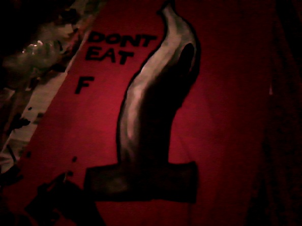
At first I really struggled with what the slogan could be. I came up with lots of ideas, but none of them were punchy enough. In the end I decided to use a slogan suggested by my friend, Amber. 
"Don't eat fin fo yo din. Have a heart, leave the shark."
The slang/casual lingo gives it a bit of humour and makes the message more accessible.
Hand-sewing on the letters has proven extremely time consuming, so I haven't quite finished as yet. But on Tuesday our class presented our work to each other and were assigned a 'lucky dip' person whose work we had to do a mini-crit on. Jadine pointed out the following about my banner:

GOOD QUALITIES
like the caption/slogan
text is clear and easy to read
black on red is good 'warning' colour scheme

AREAS FOR IMPROVEMENT
perhaps more work on the composition and where the text may be placed
colours?-maybe another that is more vibrant/contrasting

I definitely agree with the criticism of the composition, but I'm not sure it is something I will realistically be able to alter before the module deadline. After seeing the banner on the wall it was easier for me to examine how effective the composition was (unfortunately I have a very cramped room with not much space to look at it properly from a distance) and it occurred to me that it might have been a bit more interesting to change the scale of the image- perhaps to have big text in the middle and surround it with multiple smaller images of sharks.

Thursday, 27 October 2011

Time to get banner making!

I've done my best coming up with a range of ideas for slogans and effective imagery. At first I was sure I wanted to use an image of a shark being caught in a net- something like this...
...but I changed my mind because the image wasn't specifically confronting shark finning. After my research into shark finning it seemed silly to avoid the appearance of a shark after it has been finned-something which is so sad an horrific.
So, I'm going to keep the main image simple- a hammerhead with it's severed fins....
...something like this (not necessarily using this slogan).
So far the designing process has been frustrating because my resources are very limited without being able to gain access to studio equipment. This brief advises us to try and expand techniques we have been using recently. I would love to be able to do a large-scale image transfer using a colour copy of a painting because I think the watercolour is really effective in a design like the one above (loosely based on 'Jaws' poster style imagery with a single shark with a wide water background). But unfortunately I only have access to an A4 printer at the moment so this can't be an option.
However, I was impressed with the way Ed Hall's painted posters looked, so I am going to attempt to paint onto a large piece of fabric using acrylic and a large brush. I think done well, this could look great, but I haven't used acrylic paint, let alone at a large scale, for a long time, so I'm not so confident with how the results will look. I've tested on a small piece of the fabric how the paint will look, and I was disappointed. But, seeing as the piece of fabric was so small I had to use a much smaller brush, so the paint strokes weren't 'big' and gestural like I will have to do using the large brush for the banner. I quickly tested how blending looks using the large brush, and it seemed to look far more effective, so fingers crossed I can pull it together.

Tuesday, 25 October 2011

An early interest in sharks...

In primary school we were asked to do termly projects based on a topic of our choice. I stumbled across my 'Shark' project this morning. It's so old and cringey! 


Sunday, 23 October 2011

An Extreme Form of Protest

Performance artist Alice Newstead took part in a stunt lasting 15 minutes. She was suspended in a London Lush shop window, much to the shock of passers by.


An interesting form of protest...

'Around 150 people came together in Causeway Bay's Time Square at12:40pm, October 9th 2010, with participants 'freezing' into a pose that was held for 3 minutes -- much to the surprise of passers-by.'


Beginning by picking a news topic...

Now that I've seen the exhibition which inspires this project, I can get working on my own ideas for a banner. It didn't take me long to select something animal rights related.


Shark 'finning' is the appalling act when fishermen dump the live fish back in the water after cutting off the fins. As well as the devastating effects this industry is having on shark populations globally, the painful death the sharks are put through once back in the water, unable to swim, is unbelievable.

Every year tens of millions of sharks die a slow death because of finning. Finning is the inhumane practice of hacking off the shark's fins and throwing its still living body back into the sea. The sharks either starve to death, are eaten alive by other fish, or drown (if they are not in constant movement their gills cannot extract oxygen from the water).
-Stop Shark Finning
 Here is a documentary about shark finning from marine wildlife conservation organisation, Sea Shepherd.

Here is the article that inspired me to look into this topic

Saturday, 22 October 2011

On the March

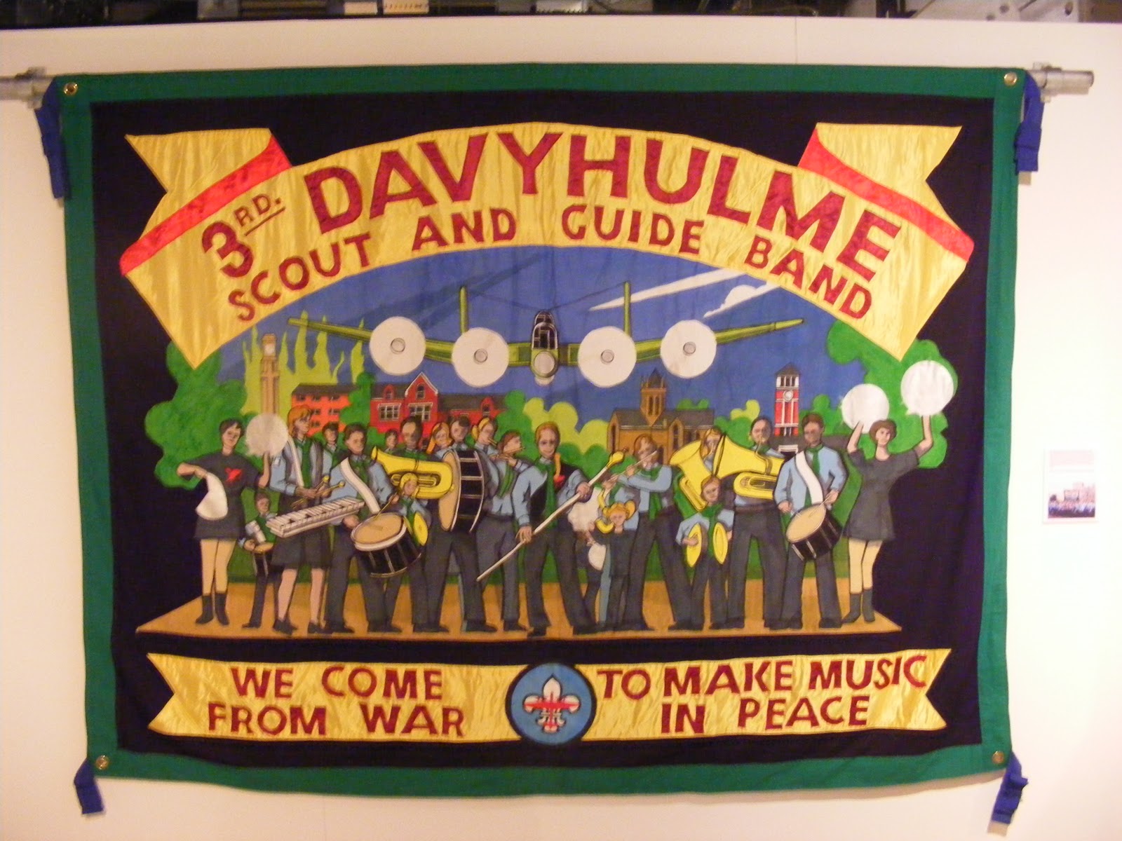
Our new project is to be based on the exhibition "On The March" by Ed Hall at the People's History Museum in Manchester. I visited the museum yesterday with my housemate, and was given permission to take photos of the banners on display.
I hadn't seen any of Hall's work prior to viewing the exhibition, so I wasn't quite sure what to expect. I was quite surprised by the style of the majority of the banners. A lot of them are quite colourful and non-aggressive , appropriate for peaceful protests, perhaps. As protest banners, a lot of the characteristics are standard for their purpose; ie. large scale, highly visible text, fairly simple large images; and the content is explicit and self-explanatory. The banners relating to protests against violence/death come across as more urgent statements, and the text and imagery seems louder/more angry (e.g. 'March Against the Brixton Bomb...' and 'Construction Safety Campaign').


My favourites of the banners were definitely the ones that used more painted imagery. The textile based work is effective and eye-catching, but not as edgy as the paintings. It seems it is hard to shake the sense that textiles is an essentially non-threatening, 'homely' medium. Painted banners connote a much more pro-active attitude, more akin to the painted slogan banners that can be seen most commonly during protests. The act of painting itself is much more aggressive and expressive than the steady, methodical methods of embroidering. The painting is not necessarily a masterpiece, but it works well to get the message of a protest across.