Sunday, 22 July 2012

Personal Project

Our summer brief this year (which will be extended over the 3rd year term time) is a self directed project.
'In short this is your time to create and work on your dream project.'
I couldn't be happier to have this opportunity!
My dream project is in fact, on dreams.
I've been looking a lot at Freud's The Interpretation of Dreams. Far from being the daunting read I thought it was going to be, after years of lurking on my bookshelf, it has provided some fascinating insight into the de-coding of the human mind's (arguably) deepest mystery.
Helpfully, the book has not been written self-indulgently at all. Freud draws from a range of other figures and beliefs when examining different aspects of his dream theories, which has provided me with a great range of quotes and particularly interesting points to focus on.

For example, I've been finding it particularly interesting to look at the theories behind the source of dream content. Freud, and mostly all modern theorists have declared dreams are a psychological activity- the mental images of the sleeper. Yet, in complete contrast, it was previously common belief that dreams were an experience introduced by a divine agency, to either help or hinder the dreamer. It would be interesting to look at dream theories from times when a less scientific view was applied, and note any connections that are still relevant to modern psychology today...

At the moment I am working on a piece which has developed from a Johann Gebhard Ehrenreich Maass quote:
Experience confirms our view that we dream most frequently of the things on which our warmest passions are centred...the lover is busied in his dreams with the object of his sweet hopes...All the sensual desires and repulsions that slumber in the heart can if anything sets them in motion, cause a dream to arise from the ideas that are associated with them or cause those ideas to intervene in a dream that is already present.

It is a wire heart framework which I'm stitching scraps of fabric over. It's quite a translucent fabric so I think it will be quite interesting to see how it will photograph when placed in front of a light source. It will allow me to place images and words inside the heart that will be visible through the fabric...but still slighty hidden. Like the mysteries of the heart can be hidden, until they are illuminated, perhaps, through a dream...

Friday, 13 July 2012

Izziyana Suhaimi

I have recently become a little bit obsessed with this wonderful artist Izziyana Suhaimi.
Her work is unique and distinctive, and something I can relate very strongly to.
Here are some examples of her pieces that caught my eye:
I think there is always something to be said for the simplicity of a good quality pencil drawing. I'm impressed with the way Izziyana has embellished her illustrations (with the dreamy watercolour backgrounds, and detailed colour popping embroidery) without 'refining' her drawings any further. It gives the images a raw and honest quality...and I admire this in the way it lays the artist quite bare- we can see exactly where her hands have been on the paper, the embroidery she has done with her own hands, the original pencil marks she has made, unclouded by the use of technology.

On her blog she states:
I am attracted to the evidence of the hand and its time-consuming aspect, which runs counter to the instant gratification and mass-production centred age of today.
I couldn't agree with this more! Her work certainly does suggest this work ethic- it is very detailed and appears very carefully and lovingly done, not a stitch/pencil line/brush stroke out of place. There is definitely a reward in work that takes such time and dedication, because (in my opinion) it does stand out a mile from the hum-drum of illustration images around us today.
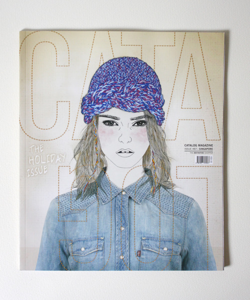
It's encouraging that other people seem to see this too, and Izziyana has been able to apply her work commercially through various interesting collaborations, including working with the creative team on a cover of the independent magazine, Catalog.
The mixture of photo, drawn and embroidered imagery looks surprisingly natural in these images, and not busy or clashing at all. Again, the bold colour of the thread is what really sets off the image, and the overall effectiveness is achieved through the knowing the careful balance of the three elements- the photo, pencil and thread are joined seamlessly.

Here's two interesting little interviews I found through a couple of blogs:

I know I'll definitely be keeping an eye on this lady's work...

Sunday, 17 June 2012

Happy fathers day!

Today I've been working on a study of one of my favourite photos of my dad and me. I made him a card with a drawing of the same image on it, but I decided it was awful so I couldn't stand not improving it!
I've been using pencil, pen and watercolour paint.
Not quite finished yet...but here's a sneaky peak...


and here's the finished card...


The first thing my dad said when I gave him this was "Is my head really that big?" Maybe I didn't get the proportions spot on but I'm still pretty pleased with this.

Sunday, 20 May 2012

Reaching the end of year 2...what next?

Friday 11th May marked the deadline of year 2. That week was highly stressful, cramming in hours of work to desperately try and finish projects to be as complete as possible, plus preparation of a mock-up portfolio and blog presentation for the rest of my class.

I know that some of my work was incomplete, but I did the best I could in the time I had, and I feel that the most important thing is that I'm proud of where my work is going and how far I've come. I've developed what I think is my 'visual language'. I have a vague template in my head of how I approach work now, which is a combination of my natural instinct to make, and my love of drawing.

The start of the summer break hasn't been a lazy period either. Last Friday I went back to Manchester for my assessment tutorial and to discuss what I will be doing for my summer project (which is-very exciting-a self-written brief). I also met with my critical studies tutor to talk about what I intend to research for my dissertation, and to get presentation and essay marks back. I was pleasantly surprised with my good results, and am now well into my research into interpreting dreams-something which is applicable to my chosen summer project and my dissertation.

Onward and upwards!

Final Photos of my Swan

I am so pleased with how these final photos looked. I took these using my own camera in the white 'bath tub' from the photography department, using one of their lights.
(Unfortunately I managed to lose the copies I made which i dropped into the Little White Lies cover template- I will upload these if I manage to get hold of them!)

Thursday, 10 May 2012

"I Wish I'd Done This..."

Here is one of my favourite images from Ronald Searle's Big Fat Cat Book.

The book as a whole is a wonderful piece of art-detailed, funny and full of variety. This is one of the images that, in my opinion, has more imaginative depth. The viewer can speculate as to what the story behind it is, in contrast to one of the simpler illustrations, such as this one, which is more of a shallow visual metaphor:
Ever since I first started being interested in art, detail has been one of the most attractive factors in drawings/paintings. During my A levels my art teacher fondly referred to my friend and me as the 'inky girls', when we were obsessed with using inks and brusho dyes, strongly influenced by artists such as Searle and Ralph Steadman. They share a quality in their work where their technical ability is enhanced by the expressive, often explosive, use of ink. 
I like the way Searle has juxtaposed the detailed, fine lines of the cat figures with the blotchy, unpredictable use of colours bleeding into water on the paper in the background. It's very atmospheric, and quite dynamic looking- the blurr in the scenery appears like bad weather, like the cats are caught in blustery rain. Whereas the cats, perfectly formed in intricate, clearly penned detail, appear still- the clear focal point. The crow is also a very ominous presence. Is he sharing our eyes on the cats? Is he a threat to them? 
The humour of the image comes from the cats seeming oblivious to their surroundings (and possible plight). The male cat is far more interested in his partner and her assets. She appears dazed, possibly zoning out of the situation- maybe she's fed up of the attention, or just so accustomed to being groped.
I also think the subtlety of the mark-making for the trees helps to really set off the image, with a perfect mixture of varied line widths and heaviness. The faded lines of the trees in the background suggest a lot of depth-the cats are sitting deep in the woods. 
This use of paler detail in the background reminds me of how we were advised to do our drawings when we went out to sketch landscapes back in my foundation year with ink and hand-crafted tools. Searle is employing traditional artists' knowledge to great effect here.
Although not as vibrant as some of Searle's illustrations, the hues used here are a great combination; the limey green, fading to yellow complements the purpley grey-brown background, separating the sky from the land.
I suppose what I'm trying to get across is that I admire how Searle has managed to get everything just right in this picture. He harnesses the skills of his art education, like great traditional painters have done before him, but applies them to his own, very individual, rebellious-looking style. Although it may appear as though this image was created swiftly and sketchily (which is a big part of its visual appeal), he is so skilled that he manages to consider a great many subtle technical aspects that make the image...almost inexplicable...so impressive. 
Looking up at the image again as I write, I've noticed the composition of the image. It is in-keeping with the rules of the golden ratio, as shown in the following diagram of the 'Fibonacci Spiral'
The cats are placed in what would be the central point of the spiral, and our eyes are guided to them by the horizon line and the vertical lines of the trees, especially the ones in the foreground which act like curtains, framing their position. Again, simple technical knowledge that has given the image impact that it otherwise may have lacked.
Personally, this image, and all of Searle's work just makes me wish I had continued to use inks more. In fact, I am tempted to use the free time I'll have over the summer to experiment with them. I miss the way their unpredictability can create 'happy accidents', considering how the way I usually work at the moment is less free, more structured and careful. But I can't hope to ever compete with someone as skilled as Searle. The  sensitivity and confidence of the marks he makes is something I can never achieve; he just seems to know exactly where to place every little detail to make the image complete, at the same time as having the spontaneous quality that comes with the use of ink.
Just wow, Mr Searle!
R.I.P.
x

Wednesday, 9 May 2012

I, 2, 3

Advice to myself:


1. Don't be afraid to seek advice/criticism.
Sometimes I feel like I'm far too stubborn and protective with my ideas, before I've shared them with my tutors. I know I shouldn't be as scared about being open to criticism, because often it has meant that I've been able to keep my idea, just an improved version. I've really had confidence in my tutors understanding my work and being able to suggest useful ways of developing it as it is in progress, so it can reach its potential better. I should just stop being terrified that advice will send me off-track when it usually helps a great deal!

2. Be open to new techniques.
Tying into my first piece of advice, I think I should be open to suggestions for techniques that will help with the efficiency of my work. I've probably become too comfortable stuck with the things that I know. Maybe I should be more actively seeking ways of making my work commercially friendly and replicable.


3. Don't be worried that predominantly 'crafty' techniques won't show my drawing ability.
People have responded so well to my sculptural work that I worry they will think it is all I can do, when in fact, I still very much enjoy drawing and painting with watercolour. Thankfully I've been developing my work in a way that has allowed me to do a bit of everything-quite a 'multimedia' approach.

Tuesday, 8 May 2012

One day brief with graphics

We were paired up with graphics students for a day-long brief where we had to create a page for a college prospectus. Mine and Phil's page was based on an average day in the life of illustration and graphics at Stockport college. We began by comparing our days, the main difference (and similarity) being the studio environment.

We wanted to show the similarities (i.e. both in studios, sharing a common room) and differences side by side, so we went with a Harvey two-face style idea, showing a single room divided into graphics and illustration. The graphics, in contrast to illustration, is very neat and plain. We used photographs of real work from the graphics and illustration studios to print out in tiny sizes to decorate the set-up with. Phil made desks and a sofa while I made the vending machine, and we used a pair of interesting characters we found in a cupboard in the illustration studio, along with a pair of chattering teeth in the role of a tutor (and Sam was kind enough to lend us a little bird she made). We hung signs around to describe the events of the day a little bit. Phil had originally designed the title banner (that I really liked!) but decided he hated it so we used my hand writing throughout.

We used a light and photo booth from the photography department to take the final image (above) using Paul's posh Canon camera. Phil was the capable photographer- the only difficult part was deciding where to focus. In the end the sharpest parts of the image were the student characters, which I think works well.


Last week we also managed to experiment briefly with some stop motion animation. We made a 12 second video showing the tutor (chattering teeth) speaking to both students then chasing the illustration girl out of the room. Overwhelmed by the commotion, the graphics student also collapses. I loved doing this animation- it was so simple! And a lot of fun. Hopefully I will be able to apply it more to my own work in a relevant way next year.

Monday, 7 May 2012

Ben Howard

I've been listening to a lot of Ben Howard lately while I've been working. It's uplifting music-calming, but still with a motivating energy to it. Especially when I'm working alone, it's good to have a little sing-along to. 
I was lucky enough to see him live a year or so ago when I saw him at a gig with my friend from York, Nathan Luke. I remember thinking he was like a more lively, acoustic David Gray. It's good to hear him being played on the radio lots at the moment!
I'm addicted to this song at the moment:

Sunday, 6 May 2012

Little White Lies (further, and very late) progression.

Finally I have allowed myself a little time to bring together my work for this brief. Last Friday's studio day was spent drawing away, studies of Natalie Portman's character from Black Swan again. I've done emulsion transfers of a  few of these and they came out really nicely- a hazy, slightly bluer effect than the original pencil and ink drawings.
Today I'm continuing with my drawings, and tomorrow will make a trip into college to get some photocopying of these done, ready for more transfers. I need a few more drawings to sew into/onto the wire structure of the swan I've made. I will be leaving it partly exposed with key quotes from the film sewn into the interior, so that you can look inside the swan to read these. Annoyingly, I had pre-made lots of carefully cut out feathers to sew to the swan, painted with black ink, and these seem to have mysteriously disappeared. I will have to do a frantic search for those or make some more.
It's probably a little late to be worrying too much about this, but I'm slightly concerned that this work will lose a lot of its impact when it is transferred into a 2D format. As I'm unable to get the help of the photography department to photograph at the moment, I will be attempting to get a decent photograph of the sculpture to use in my cover design. Hopefully it will work well enough, but I can't stop thinking how much better this will probably look as it is- i.e. viewed in person, as an object. Perhaps my work is evolving into something more suited to installation art work? I'm not sure if I like this or not....
Something for me to ponder over...