Tuesday, 11 October 2011

Totem update

It's the final week of our brief and the deadline is looming! Today has been very productive so far, but I'm confident there will be a few very late nights to get this sculpture finished in time for our photography workshop on Friday. 

Here is my progression so far:

...from the plan...


...through to some of the drawings...


...an initial attempt at an image transfer...


...to building the sculpture...

Here is the base, the plant pot structure with the venus flytrap arms. 
I weighted down the bottom by covering it in a couple of layers of mod roc. If necessary I will add more to keep it stable once I've built it up more.


Here is the heart, which will sit on top of the sculpture. The heart strings hook into the fabric and hang down to wrap around the sculpture and link with some of the venus flytrap arms.
I'm not sure if I'm 100% happy with the black lace edging around the heart-looks a little tacky? Might have to alter this if I have time.


Here I've started to build up the height of the sculpture. This was a fairly simple process: I cut lengths of wire to attach at the wire of the 'plant pot', then linked them together with wire wrapping round and upwards towards the top (like a spiral staircase).


Here I've roughly assembled the structure. The heart will sit on top (more nicely when i've tidied up the  wire). I'm pleased so far it's turning out how I want it to. 

...Had to have a bit of a break as I'm a little bit stuck with making the venus flytrap 'heads'. I set out to make the sculpture without using glue of any kind, but I think I will have to resort to using a glue gun due to the time constraints. I attempted to make a flytrap 'head' using very fine wire, and felt, sewn on to the thicker wire of the arms, which was incredibly fiddly and definitely too time consuming when I will need to make at least 16 of them...


...and finally, to give a better idea of the scale...

Monday, 10 October 2011

To hell with technical abilities. You’ll get paid more and better for the quality of your thoughts.
-James Victore
Break the rules.
I lecture to my students that they should “fuck the rules” as long as they have a good reason. I have consistently found that the students who are conservative, stay inside the lines and try to appeal to the teacher, are the students who do the most predictable work. Not bad work, just predictable. Defying the rules forces you to stray from the path of least resistance and ultimately make work that is more interesting, more meaningful and more fun to create.
But, that does not mean just be a contrarian for its own sake. It does not mean ignore any and all guidelines. It means take the requirements into consideration and break past them with good reasons and solid ideas. Breaking the rules just to be different is foolish, breaking the rules because you have a much better idea is smart.
-Mitchell Goldstein

Monday, 3 October 2011

Family Research

As I am back in my home-town York for the weekend, I've taken the time today to visit my grandad and do a bit of exploring through grandma's old things.
Part of the project I am currently working on is concerned with a representation of a hope of mine, and I've decided to centre it around hoping to make my grandma proud and reflect her influence in my life. In looking through old photos and talking to my grandad about their marriage today I've realised I also hope to experience a family/marriage of my own one day that's as loving as theirs' was. Put simply, their relationship is a big inspiration.
Most of today was spent sorting through masses of photographs, some organised neatly in albums, others stacked up in boxes; a mixture of family generations. These I will either be sketching and using as transfers, or using the photographs themselves for transfers.
After looking at the photos we looked through drawers full of various little ornaments, letters, boxes full of jewellery (mostly broaches), little bottles of perfume, scarves, gloves and some of her old clothes. It reminded   me of how much of a hoarder she was. She valued things with memories: souvenirs, photos, postcards etc, all connecting to family and friends.
I think she would have been proud to be such an important part of a personal project of mine.

Sunday, 2 October 2011

'Making is Connecting'

At the end of a hot and tiring day in the studio, Jo handed me a book that re-fuelled my motivation.
'Making is Connecting', by David Gauntlett is a book that examines 'the social meaning of creativity'.
There is an inherent pleasure in making. We might call this 'joie de faire' (like 'joie de vivre') to indicate that there is something important, even urgent, to be said about the sheer enjoyment of making something exist that didn't exist before...
Whilst fine art is more dependent on hierarchies and elites, upon which it relies to validate the work, craft is more about creativity and the process of making at a vibrant, grassroots level: proud of its grounded, everyday nature, and not insecurely waiting for an artworld critic, collector, or curator to one day say that it was all worthwhile. In particular, craft seems to be about a drive to make and share things, no matter what anyone says.
Peter Dormer says: 'Making-craft, skill, and the realisation of an object through craft labour- is not a trivial issue for craftspeople. Making is both the means through which the craftsperson explores their obsession or idea and an end in itself.'

Monday, 26 September 2011

Alex Simpson


Alex Simpson graduated in 2010 from, she works in many different ways, painting, sculpture, printmaking and animation. Her work is personal and features strange creatures as described on her profile, are about 'exploring relationships with loss, fear and the unknown'.

What is interesting for you perhaps is the flip between different mediums and how something made, informs her drawings / printmaking - I wonder which comes first. Does the drawing inspire the making or the other way round - whatever the order she seems to be absorbed in her world.

Thursday, 22 September 2011

Asami Kiyokawa

I stumbled across Kiyokawa's textile illustration work recently. I was fascinated by how colourful, rich and detailed this work was. She combines literal imagery with pattern, separately and layered up, making it look dreamy and atmospheric.
It really makes me wish I had a sewing machine!


Tuesday, 20 September 2011

Last week’s critical studies meeting

We were asked to read an article in preparation for discussion with our critical studies group.
Here is an attempt at a summary of the article I wrote in the session:

This is an essay based on an interview of James Victore by Steven Heller. It discusses his significant pieces of polemical poster works which respond to contemporary moral issues that he feels strongly about; it examines their successfulness and Victore’s progression to create his most effective possible way of impacting, as a graphic designer, on what he perceives as society’s evils.

His work made comment on the following issues:

  • Columbus day celebrations ignoring the inadvertent genocide of the Native Americans.
  • The 1993 race riots in Brooklyn between Hasidic Jews and their African-American neighbours.
  • The right-wing U.S Senator Jesse Helm's campaign for a return to 'family values' (antihomosexual and antiabortion rights).
  • The casual instillation of prejudice and hatred to impressionable young children.
  • The racism inherent in the death penalty.
The text was engaging, and conveys admiration; the writer is clearly very passionate about Victore's work.
He's a very passionate designer; the article suggests he is extremely determined and driven. The following video interview with him supported this.


Sunday, 18 September 2011

a new year begins....

Project 1a- Inventive Characters
Our first brief has been very similar to exercises we did in the first year, which were intended to loosen up our drawing styles and get us to approach it more freely. Ironically the restrictions sometimes did force me to draw in a more free and creative way sometimes.

The brief reads: "The figure is the most recurrent element you are likely to represent as an illustrator. Moreover the language for the figure is often the thing that distinguishes the 'individual handwriting' of the illustrator. It is important to remember that this process whilst rooted in academia, it can also be the catalyst for inventive and spontaneous drawing."

We were given a framework of characters and adjectives to pair together to create 6 different characters.
We had to base the drawing method on a set of rules:
  • Draw characters using only straight/ruled lines.
  • Draw characters using only circles/curves.
  • Draw characters using only torn/cut paper.
  • Draw characters using no outline.
  • Draw characters using only printed marks.

Here are some examples of the work I produced:

Some sketches based on the 3D stoat I made, using ink pen, coloured pencil and watercolour (no outline); and the 3d stoat itself!
A stoat i drew within the rough outline from the reverse side of a sewn piece, using only little straight line marks.
An angry fire eater drawn with scribbly pencil (no outline).
A proud king, collaged shapes of patterned paper.
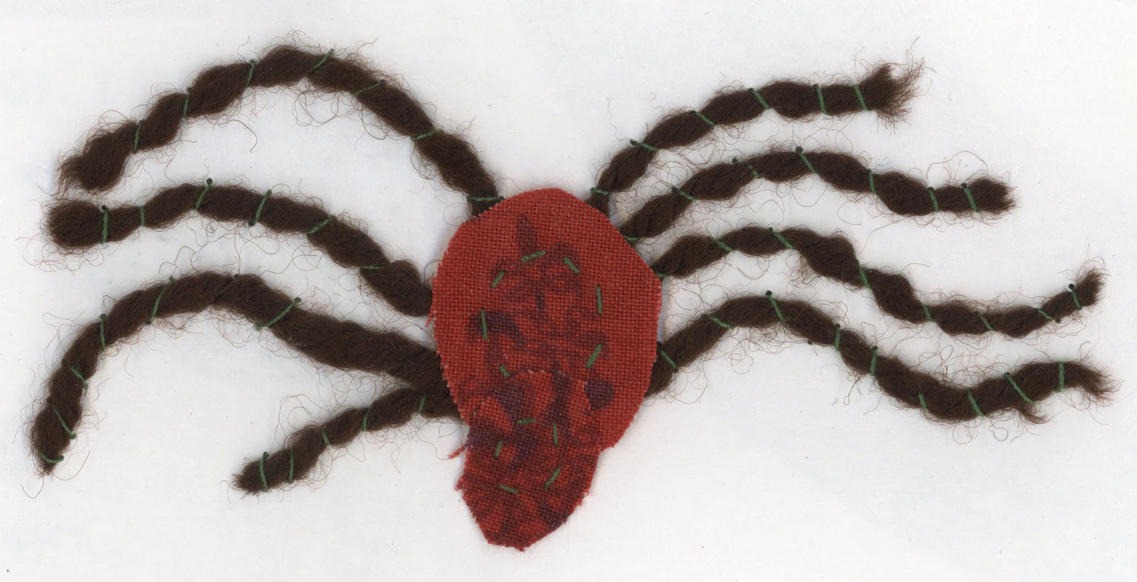
A friendly spider, made with pieces of wool and fabric sewn to paper.
Friendly spiders, dangling from web strings, pencil and collaged paper.

Getting back into working in the studio has been a bit challenging. I am determined to get back into working more naturally in 2d, and regain my confidence with ink and watercolour in particular. I've become so involved with a hands-on, 3d approach that it seems to be my default way of working. I still enjoy drawing, but i am able to create 3d characters with the least thought or effort. I am worried that creating characters with craft based methods in some ways dilutes my own personal 'visual language', in that it is much easier for somebody else to replicate to look of my 3d work, rather than the style of my drawing, which is based much more on gesture rather than practical methods. Drawing is more spontaneous and fragile, less reliable in a way, which makes a successful drawing far more rewarding. (Although i do like my little creations).

Thursday, 8 September 2011

Summer brief progression

This is a piece Hannah did, and is the first piece of work I took inspiration from in our swaps. Her use of  varying thicknesses of black line on the white background is striking and effective as an illustration depicting the scene in Waterhouse's painting. I could imagine this appearing on a poster or flyer about the nymphs.


Here is my response from Hannah's piece. I kept the black and white theme initially, using ink pen on white paper, before I added coloured pencil to a copy. Like Hannah's use of minimal features, I left the nymphs faceless, focusing instead on their hair and figures. The hair was initially intended to appear like the waves of the water, but in the finished piece they appear to be floating in air rather than water; ghost like rather than sirens? The lack of facial features makes the nymphs more menacing, and more like objects; as Hylas views them as objects of desire.


Above are two examples of Bryony's responses. We all naturally seemed to become fond of the use of lines in the hair. It creates a sense of the hair flowing, and links to the idea of water. Visually, it is overwhelming, linking to how Hylas and the nymphs' other victims relate to with the sensation of drowning in the water. 


I wanted to focus more on the faces of the nymphs. Instead of looking at the faces in the painting, I based this face on Marion Cotillard. This is because I was struggling to capture the features of Waterhouse's nymphs and studying their features became counterproductive. Also, when I imagine a nymph (i.e. enchanting faces) she is one of the first people who came to mind looks-wise. I used 2b pencil and ink pen, then photocopied the original and added watercolour. 


After studying the nymphs I decided to focus more on their environment and how I could explore that visually. The nymphs are 'children of nature' and in the painting are surrounded by lily pads, trees and flowers. My studies of these flowers evolved from a sketch I did of some flowers in a park. In the first example I created a 'flower bed', which Bryony elaborated on in her own piece:


Although the difference in our drawing styles is evident, i think the simple addition of Bryony's nymphs gives the odd bundle of flowers a place, giving the nymphs a platform for the iconic figures they are.


Hannah's translucent use of watercolour in this piece is dreamlike and adds to the tranquil atmosphere of the image. My first thoughts when looking at it was that it would make a brilliant design for a stained glass window.


In turn, I added to this piece with watercolour. It is not meant to be a literal background; more like a suggestion of their environment. I think the watercolour became too overwhelming. I needed to use more of a light suggestion of colour rather than drowning the image with it. I think the line drawing Bryony created is far more effective and is more appealing as a simple piece, like a small book illustration.